Lecture 1
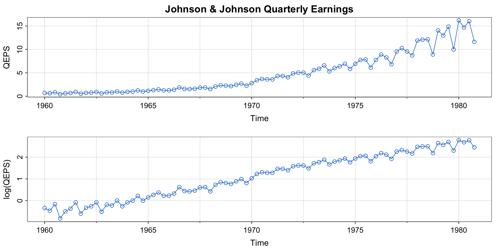
Example 1.1 (Quarterly Earnings)
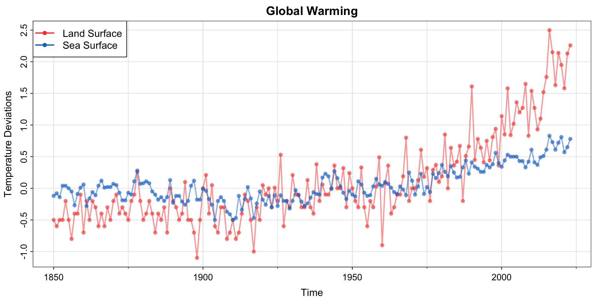
Example 1.2 (Climate Change)
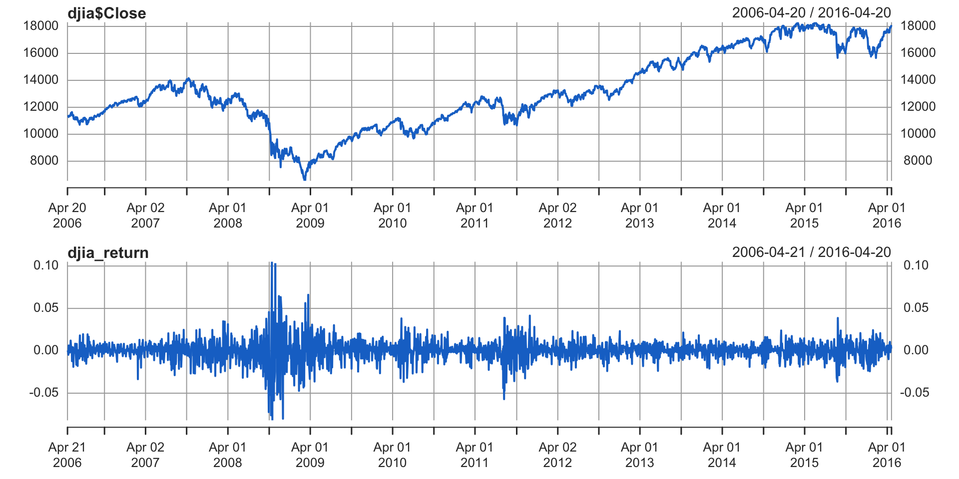
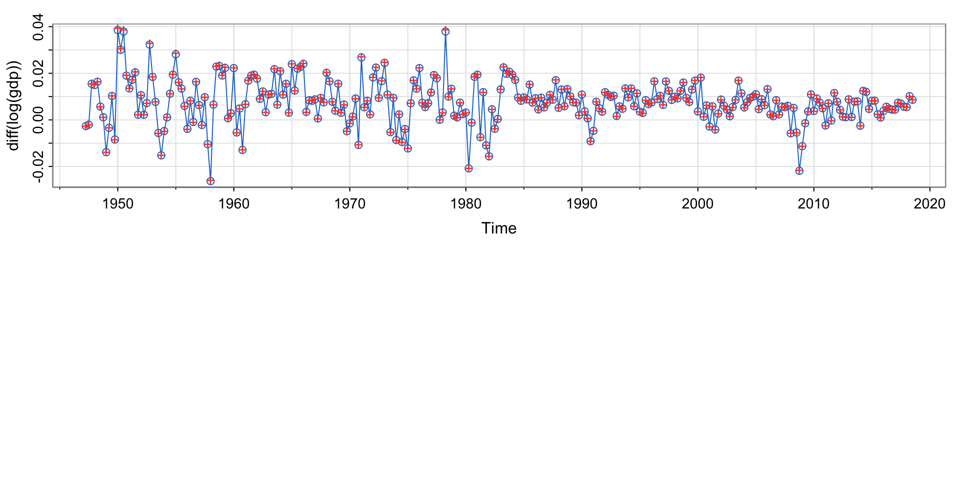
Example 1.3 (Dow Jones Industrial Average)
Code
Code
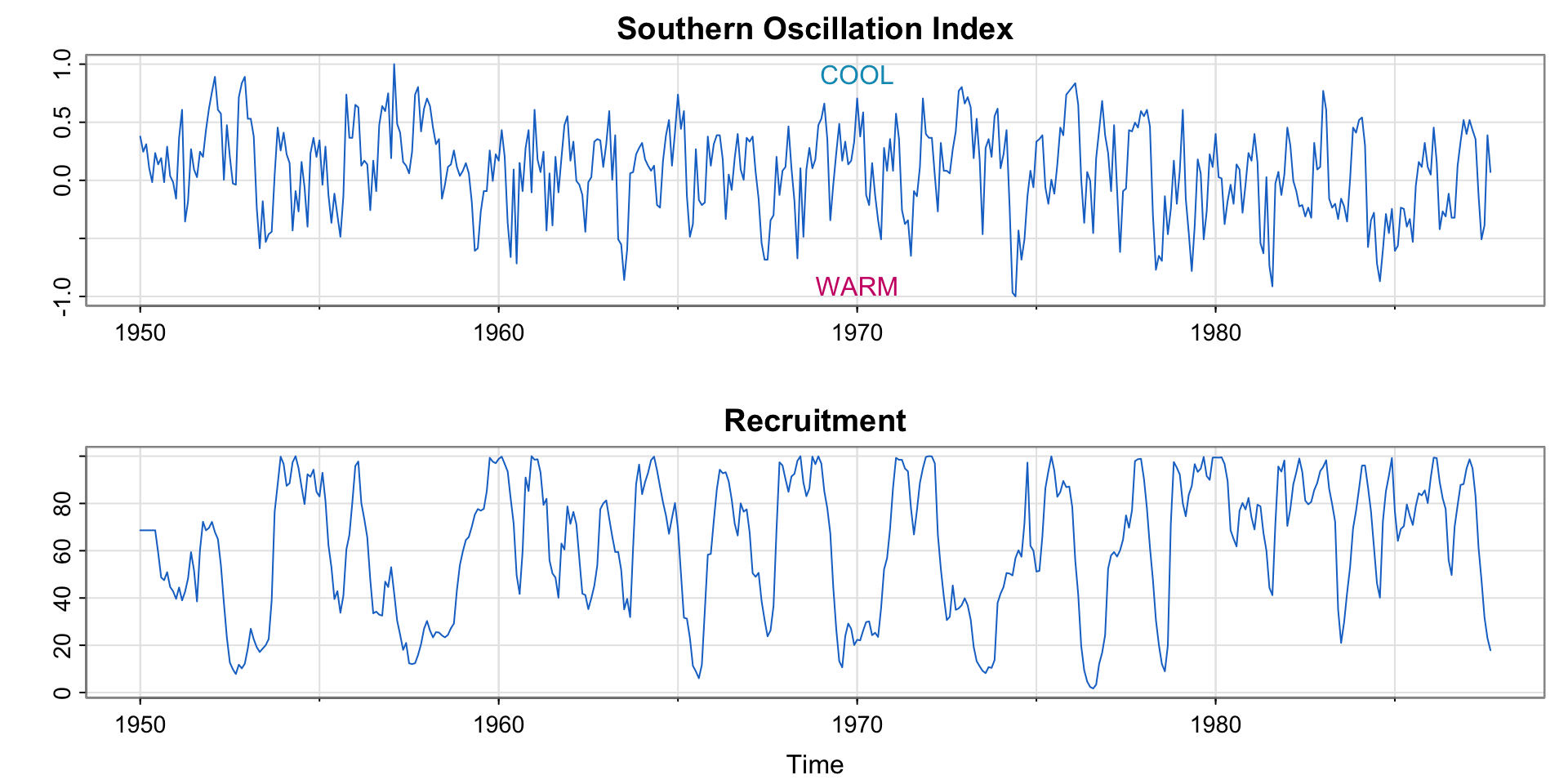
Example 1.4 El Niño
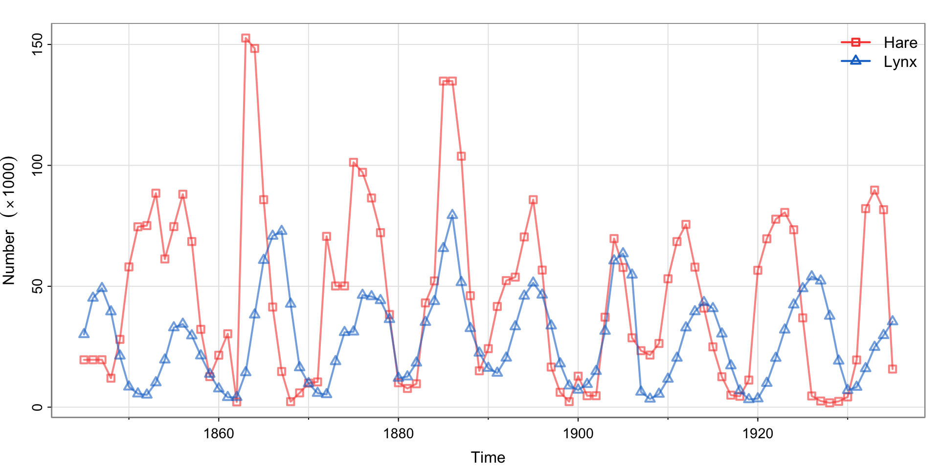
Example 1.5 (Predator-Prey Interactions)
Cute animal pictures


Example 1.6 fMRI Imaging
Code
par(mfrow=c(3,1))
x = ts(fmri1[,4:9], start=0, freq=32)        # data
names = c("Cortex","Thalamus","Cerebellum")
u = ts(rep(c(rep(.6,16), rep(-.6,16)), 4), start=0, freq=32) # stimulus signal

for (i in 1:3){
 j = 2*i-1
 tsplot(x[,j:(j+1)], ylab="BOLD", xlab="", main=names[i], col=5:6, ylim=c(-.6,.6),
        lwd=2, xaxt="n", spaghetti=TRUE)
 axis(seq(0,256,64), side=1, at=0:4)
 #lines(u, type="s", col=gray(.3))
}
mtext("seconds", side=1, line=1.75, cex=.9)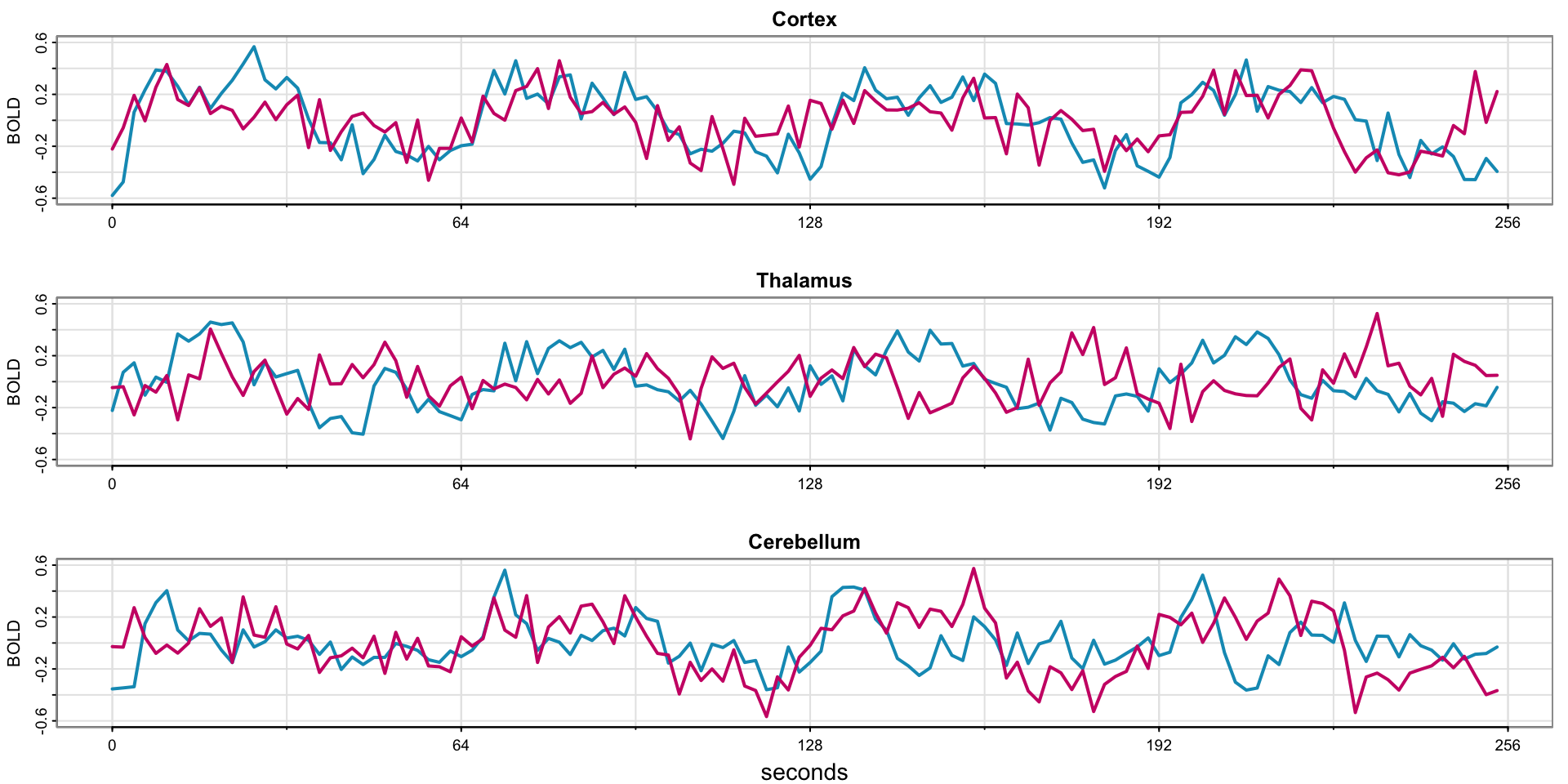
Code
par(mfrow=c(3,1))
x = ts(fmri1[,4:9], start=0, freq=32)        # data
names = c("Cortex","Thalamus","Cerebellum")
u = ts(rep(c(rep(.6,16), rep(-.6,16)), 4), start=0, freq=32) # stimulus signal

for (i in 1:3){
 j = 2*i-1
 tsplot(x[,j:(j+1)], ylab="BOLD", xlab="", main=names[i], col=5:6, ylim=c(-.6,.6),
        lwd=2, xaxt="n", spaghetti=TRUE)
 axis(seq(0,256,64), side=1, at=0:4)
 lines(u, type="s", col=gray(.3))
}
mtext("seconds", side=1, line=1.75, cex=.9)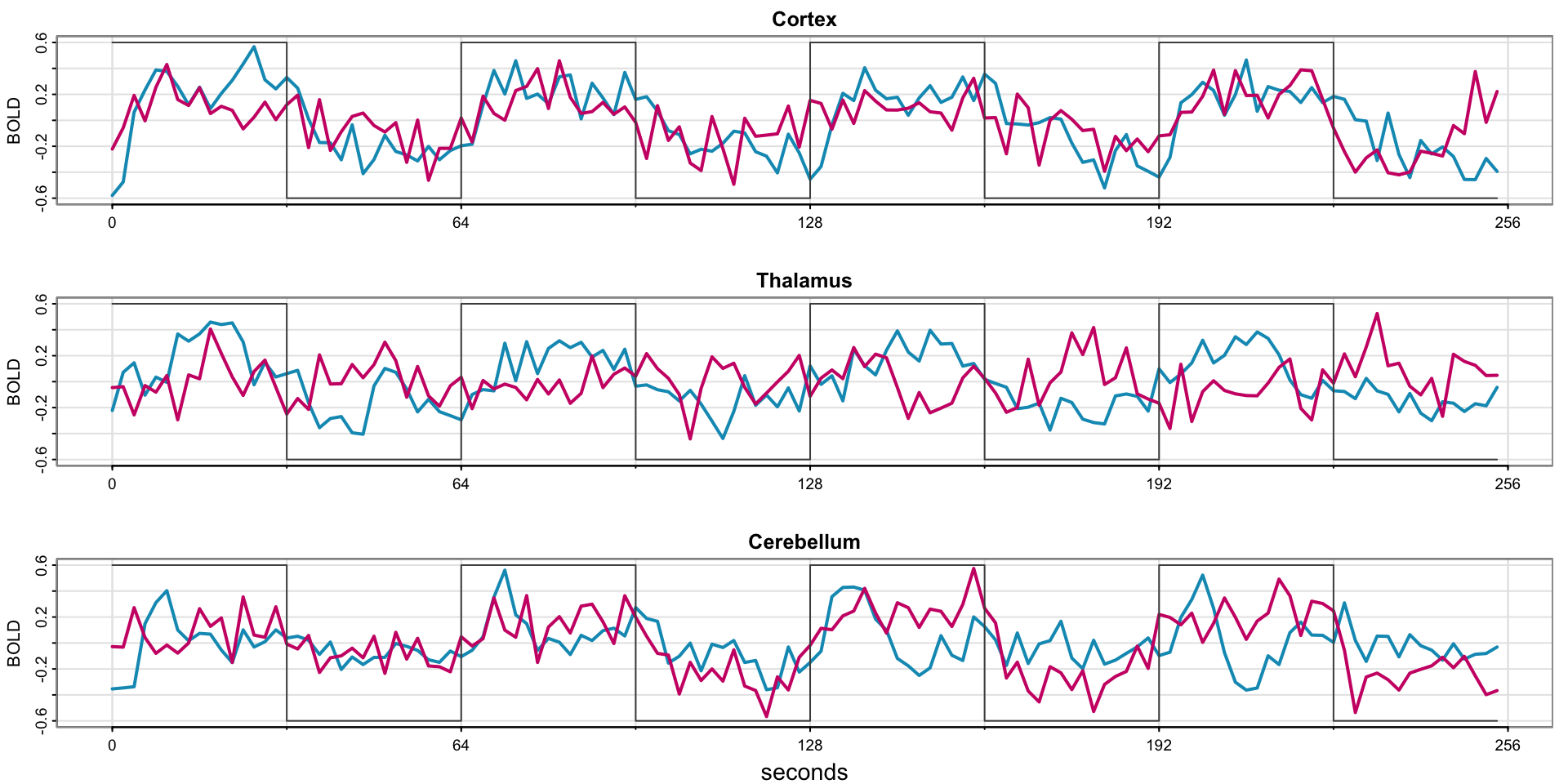
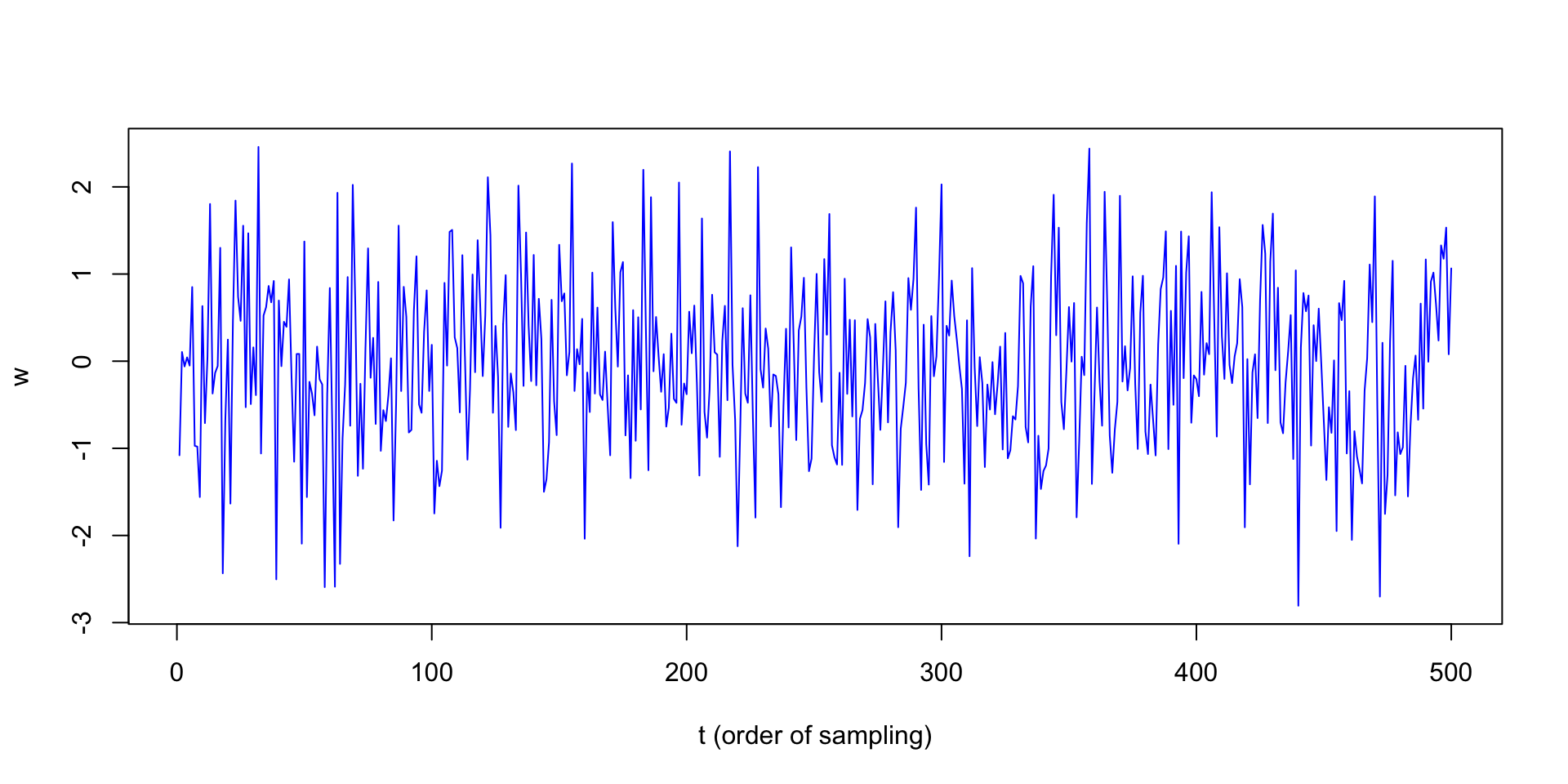
Plotting White Noise
Which example does this bear the most resemblance to?
Plotting a Moving Average
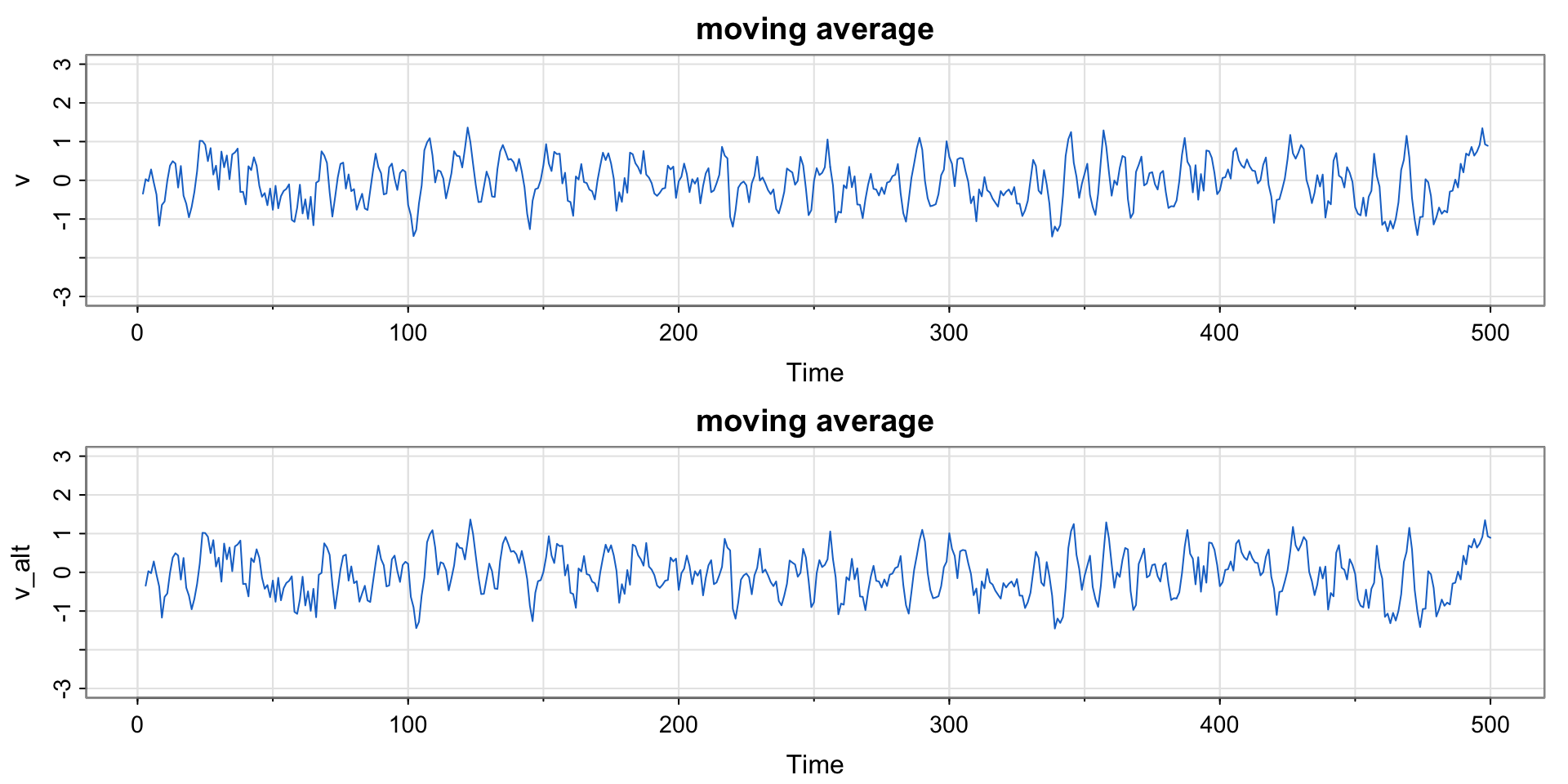
Compare this moving average to the SOI and Recruitment series. How do they differ?
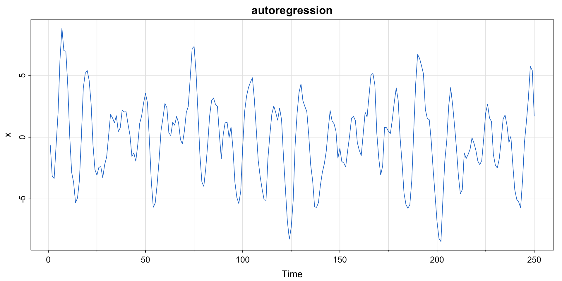
Plotting Autoregressions
Plotting a Random Walk with Drift
Code
set.seed(314159265) # so you can reproduce the results
w  = rnorm(200)  ## Gaussian white noise
x  = cumsum(w)
wd = w +.3
xd = cumsum(wd)
tsplot(xd, ylim=c(-2,80), main="random walk", ylab="", col=4)
 clip(0, 200, 0, 80)
 abline(a=0, b=.3, lty=2, col=4) # drift
lines(x, col=6)
 clip(0, 200, 0, 80)
 abline(h=0, col=6, lty=2)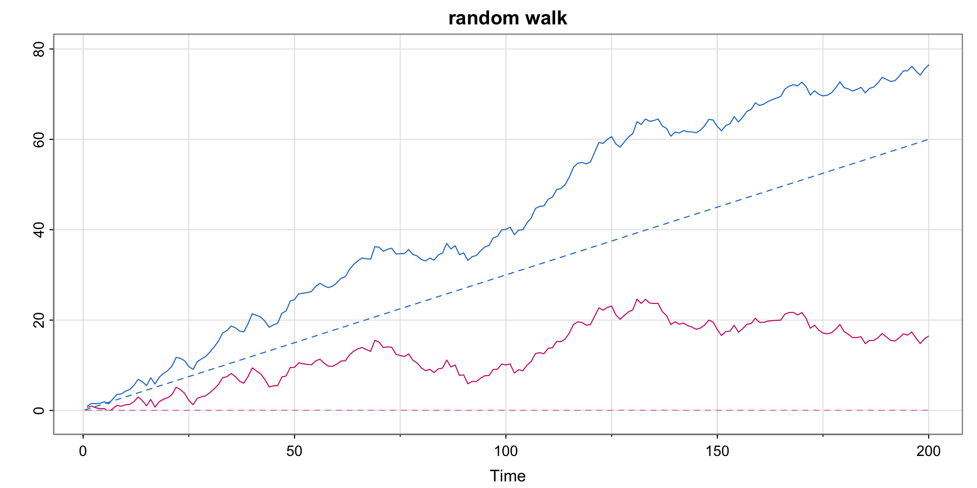
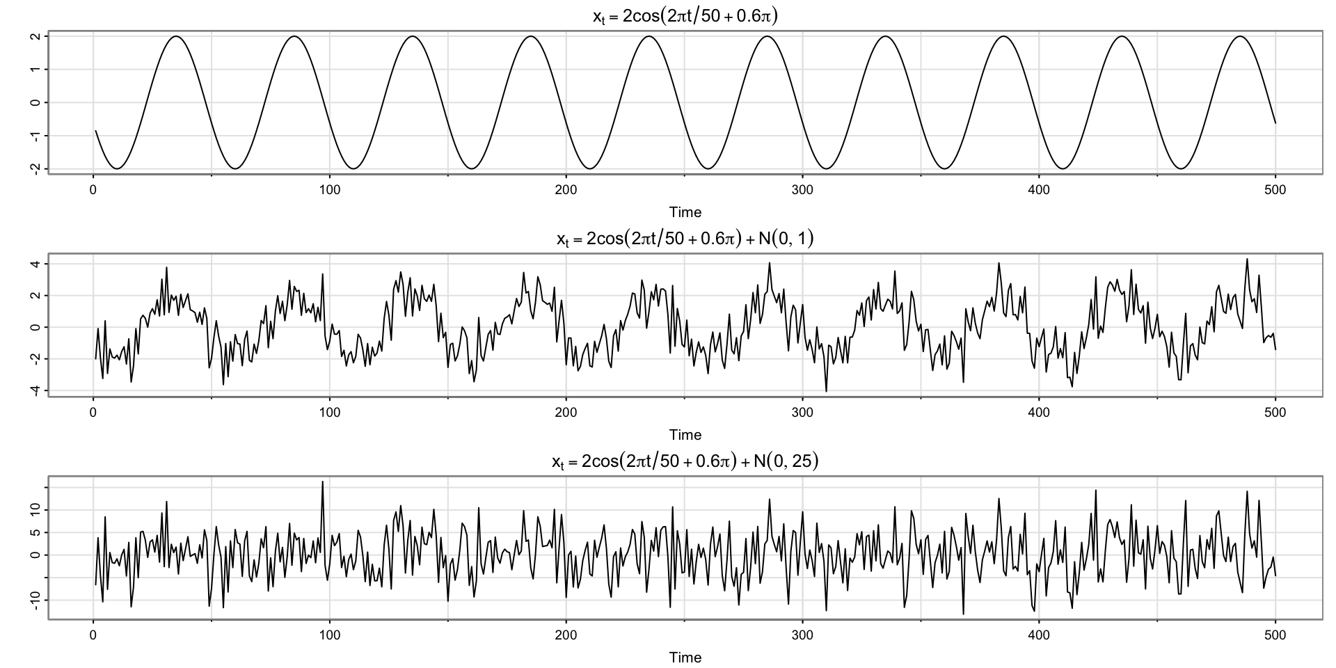
Plotting Signal Plus Noise (two scenarios)
Code
# cs = 2*cos(2*pi*(1:500)/50 + .6*pi)    # as in the text
cs = 2*cos(2*pi*(1:500+15)/50)           # same thing
w  = rnorm(500,0,1)
par(mfrow=c(3,1))
tsplot(cs, ylab="", main = expression(x[t]==2*cos(2*pi*t/50+.6*pi)))
tsplot(cs + w, ylab="", main = expression(x[t]==2*cos(2*pi*t/50+.6*pi)+N(0,1)))
tsplot(cs + 5*w, ylab="", main = expression(x[t]==2*cos(2*pi*t/50+.6*pi)+N(0,25)))