library(tidyverse)
load("fitted_models") # cleaned data and fitted models for all regionsSonifying Filters, smoothers, and data
Learning Outcomes
- sonify a time series of observed data (including missing values) using the Sonification Studio
- sonify a time series of fitted values using the Sonification Studio
- compare sonifications of filter and smoother estimates from a state space model to each other
- identify whether you are able to detect missing data in a sonification
- identify whether you are able to detect a level shift in a sonification of two series of fitted values from a level shift state space model
- compare sonifications of observed data to predicted/modeled values
- embed an html file with a sonified time series in a Quarto document
- Adjust the parameters of a sonification (min and max) to better compare series.
Read in fitted model
Recall the fitted model output from our State Space modeling of the wastewater monitoring data from the City of Houston, which includes estimates of the state, or underlying true (log10) Sars-Cov-2 viral concentration at each time point for each region.
Extract Data for just one region
Choose just one location to sonify. As a template, I have included the code for 69th street, the WWTP serving the largest population. Choose any other location!
Here, we do a bit of processing to get the data in a wider format so that we just have one row per date, one column for observed, filter estimates, and smoother estimates.
dat <-  fits_list[["69"]] %>%
  pivot_wider(
    id_cols = date,
    names_from = fit,
    values_from = est
  ) %>%
  # Now obs is duplicated in the original, but we can grab it from any row
  left_join(
    fits_list[["69"]] %>% select(date, obs) %>% distinct(),
    by = "date"
  ) %>%
  select(date, obs, everything())
Export for use with Sonification Studio
For some reason, the sonification studio was not happy with me when I included a date, but using a number for the date (and adjusting the axis label as necessary) it works well, so that’s why we are outputting just the series and the row number (via rownames argument).
write.csv(dat %>% select(obs), file = "69th_obs.csv", row.names = T)
write.csv(dat %>% select(filter), file = "69th_filter.csv", row.names = T)
write.csv(dat %>% select(smoother), file = "69th_smoother.csv", row.names = T)
Use the Sonification Studio
For each of the csv’s you just generated,
- Import the csv of the data in the “Data” tab –> Import –> CSV Data
- The sonification should appear. Change the axis labels and chart title.
- Export as html file and save in the same folder as this qmd.
Then change the code chunks below to whatever your files are, then render this .qmd doc.
Sonifications - comparing model fits to data
Discussion questions
- Can you hear the differences between the three series?
- Notice that the observed data has missing observations, but the filter and smoother estimates have interpolated a value. Can you “hear” the missing data?
- If the answer to two is “no”, how many weeks of data would have to be missing in order to “hear” the gap?
- Re-load the observed data into sonification studio and change the “obs” column values to NAs so that you have the number of weeks missing as specified in #3. Can you “hear” the missing data period?
- Describe how you would alter the sonification design to highlight the present of just one missing data point. Do you think this is necessary for clear data communication, or is it ok to gloss over just a few missing points?
Sonifications – comparing two regions’ fitted values
Our state space model specification above represents the true state of viral dynamics as a single, citywide trend and includes a level shift on the observation equations, meaning that the fitted values for each region only differ by a constant \(a_i\).
Let’s see if we can hear this constant difference. Let’s use the smoothers, and just create a sonification for another region.
Note: Watch carefully after you upload the data: you will see the series shift vertically!
dat <-  fits_list[["SW"]] %>%
  pivot_wider(
    id_cols = date,
    names_from = fit,
    values_from = est
  ) %>%
  # Now obs is duplicated in the original, but we can grab it from any row
  left_join(
    fits_list[["SW"]] %>% select(date, obs) %>% distinct(),
    by = "date"
  ) %>%
  select(date, obs, everything())

write.csv(dat %>% select(smoother), file = "SW_smoother.csv", row.names = T)It almost sounds like there is no difference, but perhaps we happened to choose two series that were close in value. Let’s visualize the data and see if we can quickly identify a different region that can help get the level shift information across.
Code
library(sf) ## mapping package
load("shp_df.RData") ## mapping data
load("all_ts_observed.Rdata") ## additional data needed for plotting code
load("FullModel.RData") ## model estimates
wwtpfixed <- unique(all_ts_observed[,1:4])

param_ests <- data.frame(wwtpfixed$WWTP,
                           std_err_params$par$A,
                        std_err_params$par.se$A,
                         std_err_params$par.lowCI$A,
                         std_err_params$par.upCI$A,
                        std_err_params$par$R,
                        std_err_params$par.se$R)
names(param_ests) <- c("WWTP", "level_shift",
                       "se_level_shift",
                       "low.CI_level_shift",
                       "up.CI_level_shift",
                       "obs_var",
                       "se_obs_var")

out <- shp_df_out |>
  left_join(param_ests, by = c("WWTP" = "WWTP"))
Code
## mapping code
ggplot(out, aes(fill = level_shift)) +
  geom_sf() +
  geom_sf_text(aes(label = WWTP), size = 1.75, check_overlap = T) +
  scale_fill_gradient2(
    low = "#78C169",
    mid = "white",
    high = "#790FB9",
    midpoint = 0,
    limits = c(-.5,.5)) +
  theme_void() +  # Keep theme_void() for a clean map background
  theme(
    legend.position = "bottom",  # Add the legend back on the right
    legend.background = element_rect(fill = "white", color = NA),  # Add a white background to legend
    legend.title = element_text(size = 5),  # Adjust legend title size if needed
    legend.text = element_text(size = 5)  # Adjust legend text size if needed
  ) +
  labs(title = "A: Level Shift Est",
       fill = "LS Est") +
  theme(plot.title = element_text(hjust = 0.5, size = 10))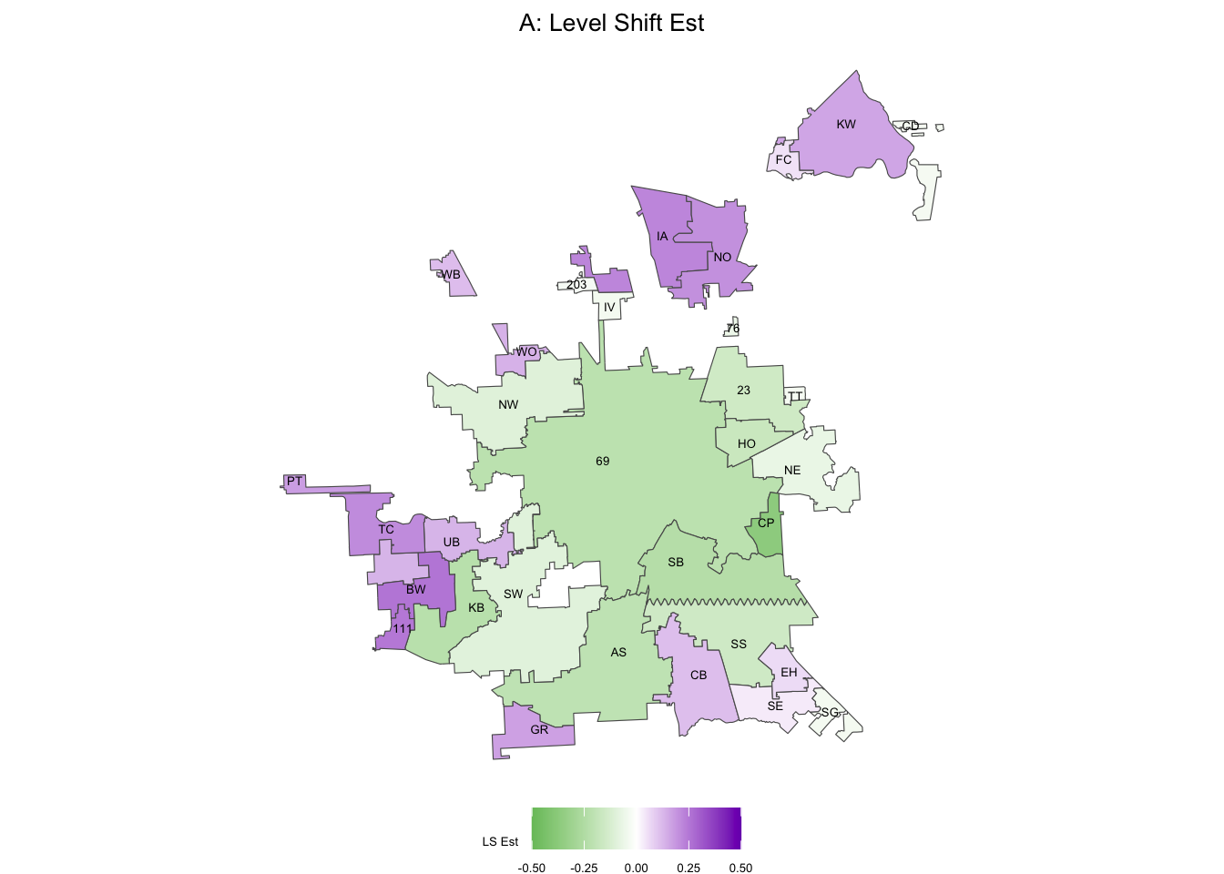
Unsurprisingly, 69 and SB are close in color space (they were close in frequency as well, when we sonified). Let’s try one of the purple regions, like BW:
dat <-  fits_list[["BW"]] %>%
  pivot_wider(
    id_cols = date,
    names_from = fit,
    values_from = est
  ) %>%
  # Now obs is duplicated in the original, but we can grab it from any row
  left_join(
    fits_list[["BW"]] %>% select(date, obs) %>% distinct(),
    by = "date"
  ) %>%
  select(date, obs, everything())

write.csv(dat %>% select(smoother), file = "BW_smoother.csv", row.names = T)Hmm, actually, they all sound the same. This is because we have independently generated each of these sonifications and they have been given the same minimum and maximum values in frequency space. Since our smoother curves for each region only differ up to a constant, this means they will sound identical unless we adjust the minimum and maximum values.
Why wasn’t this an issue for the observed, filter, and smoother sonifications for 69th street?
Since the filter and smoother are the output of models fit to the observed data, they are similar in value, so while there differences, they would probably not be audibly detectable even if we did adjust the mins and maxes in the audio settings of the sonification.
What should we set the maximum and minimum values to?
we can just figure out the all time high and low values for each of the smoothed series, convert to a scale of 36-90 (the default range in the sonification tool), then adjust those values before outputting the html sonifications.
range_bw <- fits_list[["BW"]] %>% filter(fit == "smoother") %>% select(est) %>% range()
range_sw <- fits_list[["SW"]] %>% filter(fit == "smoother") %>% select(est) %>% range()
range_69 <- fits_list[["69"]] %>% filter(fit == "smoother") %>% select(est) %>% range()

all_min <- min(range_bw[1], range_sw[1], range_69[1])

all_max <- max(range_bw[2], range_sw[2], range_69[2])

round(((range_bw - all_min)/(all_max - all_min))*(90-36) + 36)
[1] 45 90round(((range_sw - all_min)/(all_max - all_min))*(90-36) + 36)[1] 38 83round(((range_69 - all_min)/(all_max - all_min))*(90-36) + 36)[1] 36 81Level-Adjusted Sonifications (default)
Level-Adjusted Sonifications (more extreme)
If we want to sonify across a broader spectrum of notes (frequencies) we can adjust the default range of the sonfiication below the default (I’ll just adjust the lower bound):
round(((range_bw - all_min)/(all_max - all_min))*(90-15) + 15)[1] 28 90round(((range_sw - all_min)/(all_max - all_min))*(90-15) + 15)[1] 18 81round(((range_69 - all_min)/(all_max - all_min))*(90-15) + 15)[1] 15 77Level-Adjusted Sonifications (lower min note than default)
Compare the first few seconds of each sonification to the other regions, then to the same region for the default. Is the difference in level more clear?
How can we better sonify the level shift information?
One idea: we can create an audio version of the above static map that visualizes the estimated level shifts. See example below with population density in France.