Code
# Set up packages and functions
library(tidyverse)
library(kableExtra)
library(htmlTable)
library(gt)
source("code/cummax_ignore_na.R")
source("code/cummin_ignore_na.R")For monthly temperature data, this file shows:
# Set up packages and functions
library(tidyverse)
library(kableExtra)
library(htmlTable)
library(gt)
source("code/cummax_ignore_na.R")
source("code/cummin_ignore_na.R")Three data sets were downloaded from the NOAA National Weather service NOWData tool.
All data sets are for Paso Robles, CA, from the start of data collection (“por”) to present (2025).
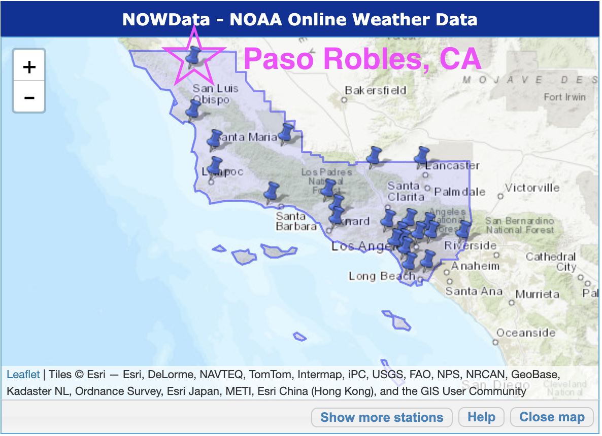
We requested the monthly maximums, monthly minimums, and monthly averages.
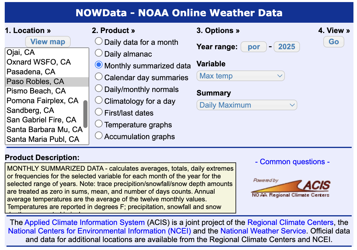 After clicking “Go”, a data table pops up. We copied it and pasted into Microsoft Excel, removed the summary rows included at the bottom, then saved as a csv.
This process yielded 3 csv files: paso_max.csv, paso_min.csv, and paso_avg.csv.
Read in, combine, and process data from the csv files obtained above.
## Read in Csv's for min, mean, max
min_data <- read.csv("data/paso_min.csv", na.strings = "M")
min_data <- min_data %>%
  select(-Annual) %>%
  pivot_longer( ## one row = one month
    cols = Jan:Dec,
    names_to ="month",
    values_to = "min"
    )


mean_data <- read.csv("data/paso_avg.csv", na.strings = "M")

mean_data <- mean_data %>%
  select(-Annual) %>%
  pivot_longer( ## one row = one month
    cols = Jan:Dec,
    names_to ="month",
    values_to = "mean"
    )


max_data <- read.csv("data/paso_max.csv", na.strings = "M")

max_data <- max_data %>%
  select(-Annual) %>%
  pivot_longer( ## one row = one month
    cols = Jan:Dec,
    names_to ="month",
    values_to = "max"
    )

## combine data sets and add date formatting
monthly_weather <- bind_cols(min_data,
                             mean_data[,3],
                             max_data[,3]) %>%
  mutate(date = ym(paste0(year, "-", month)))

## add seasonal variables

monthly_weather <- monthly_weather %>%
  mutate(
    season = case_when(
      month %in% c("Dec", "Jan", "Feb") ~ "Winter",
      month %in% c("Mar", "Apr", "May")  ~ "Spring",
      month %in% c("June", "July", "Aug")  ~ "Summer",
      month %in% c("Sept", "Oct", "Nov") ~ "Fall"
  ),
  season_color = case_when(
      month %in%  c("Dec", "Jan", "Feb")  ~ "#2f77c3",
      month %in% c("Mar", "Apr", "May")  ~ "#61bf9a",
      month %in% c("June", "July", "Aug")  ~ "#f94994",
      month %in% c("Sept", "Oct", "Nov") ~ "#eb9911"
  ),
  season_year = case_when(
      month == "Dec" ~ year + 1,  # December belongs to *next* Jan/Feb
      .default = year
  ),
    season_label = paste(season, season_year)
  ) %>%
  group_by(season, year) %>%
  ungroup()  %>%
  mutate(
         month = factor(month, levels = c("Dec", "Jan", "Feb", "Mar", "Apr", "May" , "June", "July", "Aug",  "Sept", "Oct",  "Nov") ))


monthly_weather <- monthly_weather %>%
  group_by(season_label, season_year) %>%
  mutate(
    xmin = min(date),
    xmax = max(date),
    seas_avg = mean(mean),
    seas_max = max(max),
    seas_min = min(min),
    season_color = unique(season_color),
    season = unique(season)
  ) %>%
  ungroup() %>%
  mutate(season = factor(season, levels = c("Winter", "Spring", "Summer", "Fall")))
This gets us three monthly time series, which we can visualize.
## color palatte
plot_cols <- c("max" = "red", "min" = "blue", "mean"="grey", "Winter" = "#2f77c3", "Spring" = "#61bf9a", "Summer" = "#f94994", "Fall" =  "#eb9911")

monthly_weather %>%
  ggplot(aes(x = date)) +
  geom_line(aes(y = min, col = "min")) +
  geom_line(aes(y = max, col = "max")) +
  geom_line(aes(y = mean, col = "mean")) +
  scale_color_manual(values = plot_cols)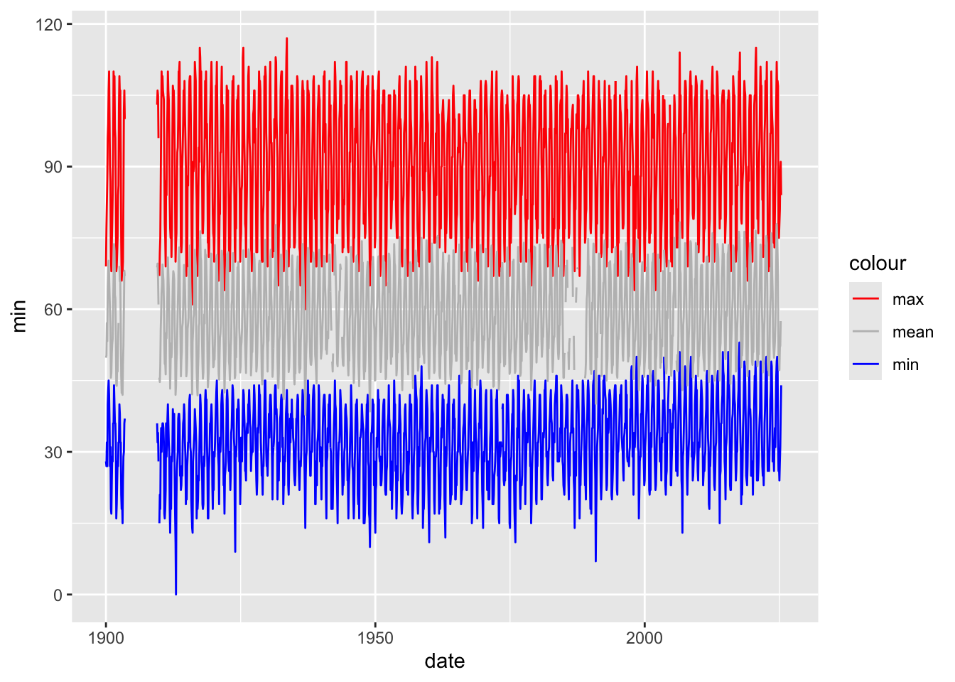
We can clearly see that the maximum series is consistently above the average, which is consistently above the minimum, as we expect.
It’s hard to see the monthly variation on this long time scale, so we will zoom in to just 10 years of data starting after the missing data period at the beginning (after 1909):.
monthly_weather %>%
  filter(between(year, 1910, 1919)) %>%
  ggplot(aes(x = date)) +
  geom_line(aes(y = min, col = "min")) +
  geom_point(aes(y = min, col = "min"))+
  geom_line(aes(y = max, col = "max")) +
  geom_point(aes(y = max, col = "max"))+
  geom_line(aes(y = mean, col = "mean")) +
  geom_point(aes(y = mean, col = "mean"))+
  scale_color_manual(values = plot_cols)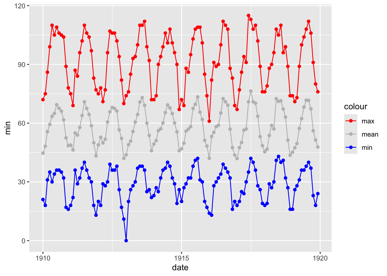
Each dot on the plot corresponds to one month in a given year. The annual seasonal patterns are defined by the apparent winter valleys and summer peaks.
We can add the information about each season by coloring the points in the above plot:
monthly_weather %>%
  filter(between(year, 1910, 1919)) %>%
  ggplot(aes(x = date)) +
  geom_line(aes(y = min, col = "min")) +
  geom_point(aes(y = min, col = season))+
  geom_line(aes(y = max, col = "max")) +
  geom_point(aes(y = max, col = season))+
  geom_line(aes(y = mean, col = "mean")) +
  geom_point(aes(y = mean, col = season))+
  scale_color_manual(values = plot_cols)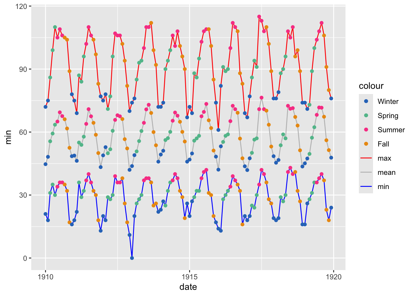
Summer and winter are confirmed as the high and low points, and we see spring and fall on the appropriate “sides” of the distribution. We see these relative seasonal patterns in all three summary statistics, which makes sense: we expect the lowest high to be in winter, and the highest low to be in summer, and so on.
Since months and seasons both capture the structure of the annual variation, we can aggregate to the monthly or seasonal level to gain additional insight to the series as a whole (without having to zoom in).
We will visually (plots) and numerically (tables) examine the following statistics:
For the full history January 1900- May 2025.
summary_table_all <- monthly_weather %>%
  summarise(
    ## mean
    mean_Min = mean(min, na.rm = T),
    mean_Mean = mean(mean, na.rm = T),
    mean_Max = mean(max, na.rm = T),
    ## sd
    sd_Min= sd(min, na.rm = T),
    sd_Mean = sd(mean, na.rm = T),
    sd_Max = sd(max, na.rm = T),
    ## max
    max_Min = max(min, na.rm = T),
    max_Mean = max(mean, na.rm = T),
    max_Max = max(max, na.rm = T),
    ## min
    min_Min = min(min, na.rm = T),
    min_Mean = min(mean, na.rm = T),
    min_Max = min(max, na.rm = T),
  )

## chat help

facet_vars <- c("min", "mean", "max")

# Step 1: Pivot your summary table
vline_data <- summary_table_all %>%
  pivot_longer(cols = contains(c("Min_min", "Mean_mean", "Max_max")),
               names_to = "name", values_to = "xintercept")
vline_data$name = facet_vars


monthly_weather %>%
  bind_cols(summary_table_all[rep(1, nrow(monthly_weather)), ]) %>%
  select(-c(xmin, xmax)) %>%
  pivot_longer(cols = contains(c("min", "mean", "max"))) %>%
  filter(name %in% facet_vars) %>%
  select(year, month, date, season, name, value) %>%
  ggplot(aes(x = value, fill = name)) +
  geom_histogram(bins = 30) +
  geom_vline(
    data = vline_data,
    aes(xintercept = xintercept),
    color = "black", linewidth = 2, linetype = "solid"
  ) +
  geom_vline(
    data = vline_data,
    aes(xintercept = xintercept, color = name),
    linewidth = 1, linetype = "solid"
  ) +
  facet_grid(name~., scales = "fixed") +
  theme_minimal() +
  scale_fill_manual(values = plot_cols)+
  scale_color_manual(values = plot_cols)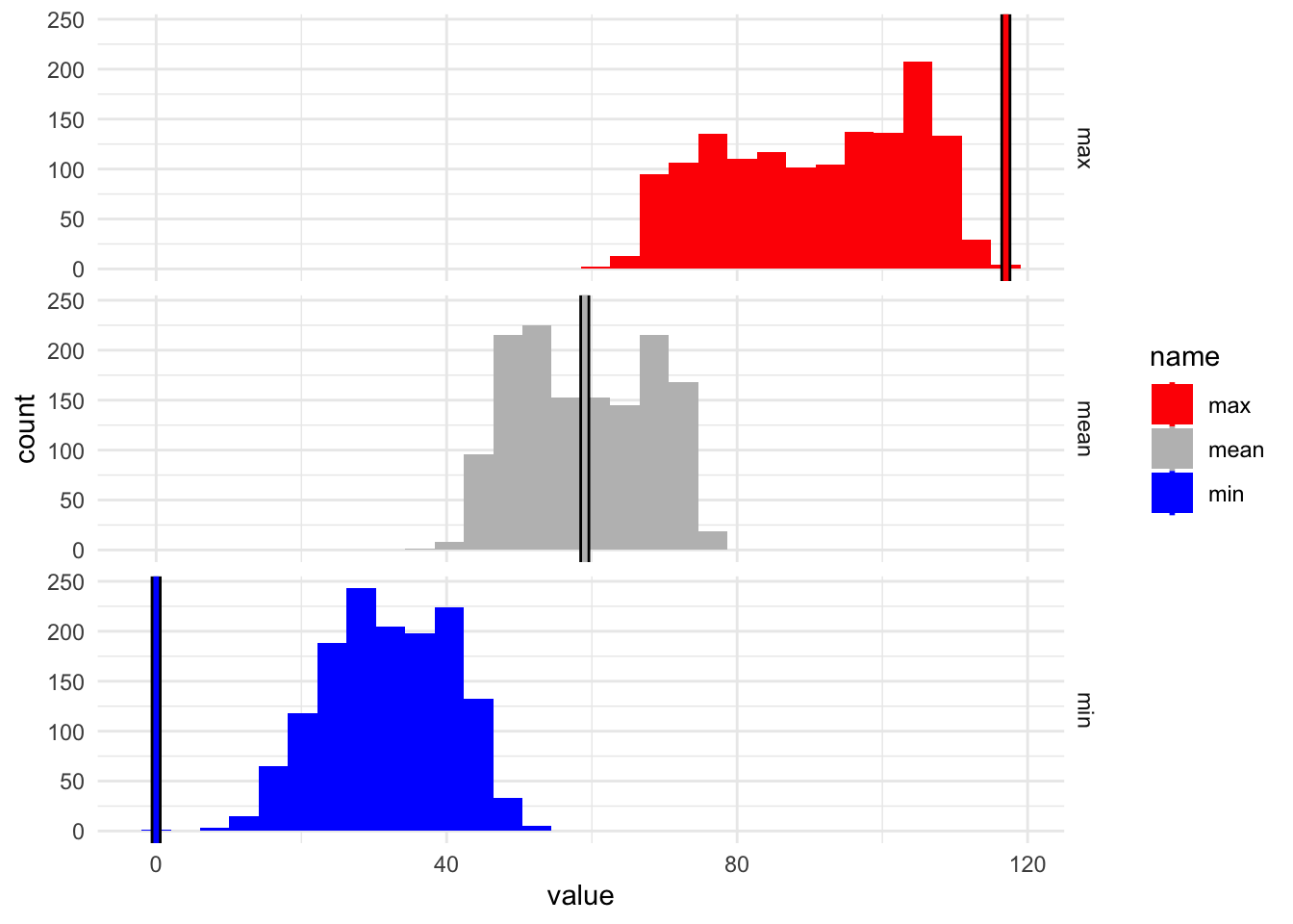
## chat help

facet_vars <- c("min", "mean", "max")

# Step 1: Pivot your summary table
vline_data <- summary_table_all %>%
  pivot_longer(cols = contains(c("min_Min", "Mean_mean", "Max_max")),
               names_to = "name", values_to = "xintercept")
vline_data$name = facet_vars


monthly_weather %>%
  bind_cols(summary_table_all[rep(1, nrow(monthly_weather)), ]) %>%
  select(-c(xmin, xmax)) %>%
  pivot_longer(cols = contains(c("min", "mean", "max"))) %>%
  filter(name %in% facet_vars) %>%
  select(year, month, date, season, name, value) %>%
  ggplot(aes(x = value, fill = name)) +
  geom_boxplot() +
    geom_vline(
    data = vline_data,
    aes(xintercept = xintercept),
    color = "black", linewidth = 2, linetype = "solid"
  ) +
  geom_vline(
    data = vline_data,
    aes(xintercept = xintercept, color = name),
    linewidth = 1, linetype = "solid"
  ) +
  facet_grid(name~., scales = "fixed") +
  theme_minimal() +
  scale_fill_manual(values = plot_cols)+
  scale_color_manual(values = plot_cols)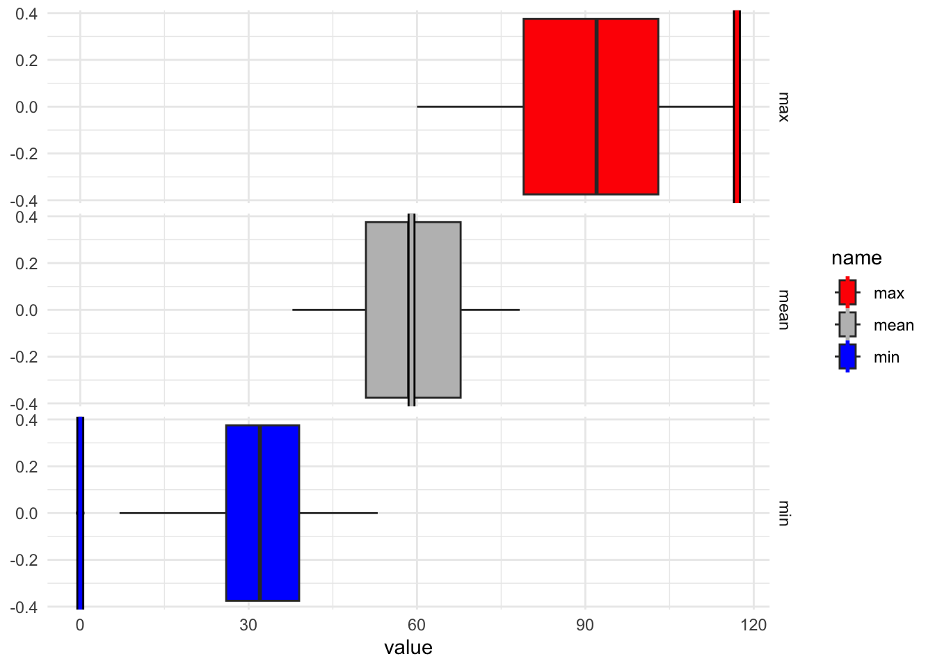
summary_table_all %>%
select(-c(max_Min, min_Max, min_Mean, max_Mean))%>%
gt() %>%
  tab_header(
    title = "All-time Summaries"
  ) %>%
  fmt_number(
    columns = where(is.numeric),
    decimals = 2
  )%>%
  cols_label(
    min_Min = "Min",
    mean_Min = "Mean",
    sd_Min = "SD",
    mean_Mean = "Mean",
    sd_Mean = "SD",
    max_Max = "Max",
    mean_Max = "Mean",
    sd_Max= "SD"
  ) %>%
  tab_spanner(
    label = "Monthly Minimums",
    columns = c(min_Min, mean_Min, sd_Min)
  ) %>%
  tab_spanner(
    label = "Monthly Means",
    columns = c(mean_Mean, sd_Mean)
  ) %>%
  tab_spanner(
    label = "Monthly Maximums",
    columns = c(mean_Max, sd_Max, max_Max)
)| All-time Summaries | |||||||
|---|---|---|---|---|---|---|---|
Monthly Means
|
Monthly Maximums
|
Monthly Minimums
|
|||||
| Mean | SD | Mean | SD | Max | Min | Mean | SD |
| 59.02 | 9.22 | 90.69 | 13.27 | 117.00 | 0.00 | 32.13 | 8.52 |
month.abb = c("Dec", "Jan", "Feb", "Mar", "Apr", "May" , "June", "July", "Aug",  "Sept", "Oct",  "Nov")
summary_table <- monthly_weather %>%
  mutate(month = factor(month, levels = month.abb)) %>%
  group_by(month) %>%
   summarise(
    ## mean
    mean_Min = mean(min, na.rm = T),
    mean_Mean = mean(mean, na.rm = T),
    mean_Max = mean(max, na.rm = T),
    ## sd
    sd_Min= sd(min, na.rm = T),
    sd_Mean = sd(mean, na.rm = T),
    sd_Max = sd(max, na.rm = T),
    ## max
    max_Min = max(min, na.rm = T),
    max_Mean = max(mean, na.rm = T),
    max_Max = max(max, na.rm = T),
    ## min
    min_Min = min(min, na.rm = T),
    min_Mean = min(mean, na.rm = T),
    min_Max = min(max, na.rm = T),
  )%>%
  arrange(month)

plot_cols <- c(plot_cols, "min_Min" = "blue", "mean_Mean" = "grey", "max_Max" = "red")

agg_plot<- summary_table %>%
  ggplot(aes(x = month)) +
  geom_line(aes(y = min_Min, col = "min_Min", group = 1), linewidth = .75) +
  geom_line(aes(y = mean_Mean, col = "mean_Mean", group = 1), linewidth = .75) +
  geom_line(aes(y = max_Max, col = "max_Max", group = 1), linewidth = .75) +
  geom_point(aes(y = min_Min, col = "min_Min", group = 1), size = 3) +
  geom_point(aes(y = mean_Mean, col = "mean_Mean", group = 1), size = 3) +
  geom_point(aes(y = max_Max, col = "max_Max", group = 1), size = 3) +
  scale_color_manual(values = plot_cols, name = "Legend") +
  ylab("Temperature (F)")+ xlab("Month") +
   theme(panel.grid.major = element_blank(),
       panel.grid.minor = element_blank(),
       panel.background = element_blank(),
       axis.line = element_blank(),
       axis.title.y = element_text(angle = 0, vjust = .5)) + ylim(c(0,120))

agg_plot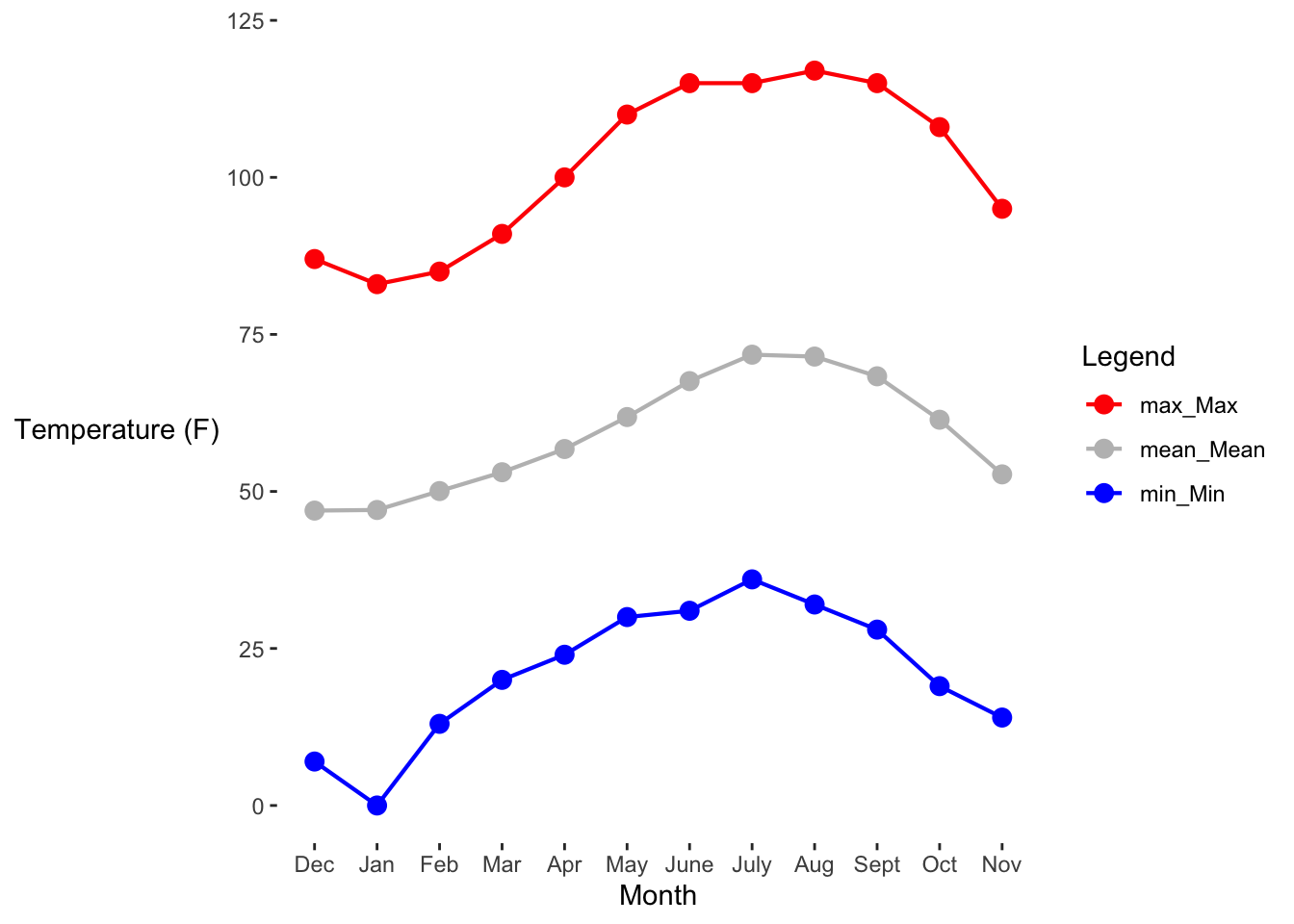
agg_plot +
  geom_point(data = monthly_weather, aes(x = month, y = min, col = season), alpha = 0.1, position = position_jitter()) +
  geom_point(data = monthly_weather, aes(x = month, y = mean, col = season), alpha = 0.1, position = position_jitter()) +
  geom_point(data = monthly_weather, aes(x = month, y = max, col = season), alpha = 0.1, position = position_jitter())  +
  ylab("Temperature (F)")+ xlab("Month") +
   theme(panel.grid.major = element_blank(),
       panel.grid.minor = element_blank(),
       panel.background = element_blank(),
       axis.line = element_blank(),
       axis.title.y = element_text(angle = 0, vjust = .5)) +
  ylim(c(0,120))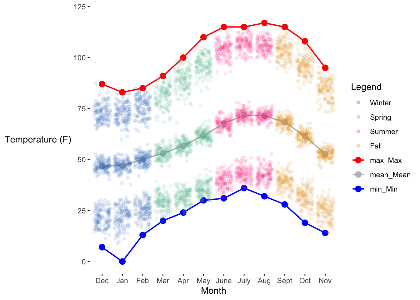
summary_table %>%
select(-c(max_Min, min_Max, min_Mean, max_Mean))%>%
gt() %>%
  tab_header(
    title = "All-time Summaries"
  ) %>%
  fmt_number(
    columns = where(is.numeric),
    decimals = 2
  )%>%
  cols_label(
    min_Min = "Min",
    mean_Min = "Mean",
    sd_Min = "SD",
    mean_Mean = "Mean",
    sd_Mean = "SD",
    max_Max = "Max",
    mean_Max = "Mean",
    sd_Max= "SD"
  ) %>%
  tab_spanner(
    label = "Monthly Minimums",
    columns = c(min_Min, mean_Min, sd_Min)
  ) %>%
  tab_spanner(
    label = "Monthly Means",
    columns = c(mean_Mean, sd_Mean)
  ) %>%
  tab_spanner(
    label = "Monthly Maximums",
    columns = c(mean_Max, sd_Max, max_Max)
)| All-time Summaries | ||||||||
|---|---|---|---|---|---|---|---|---|
| month |
Monthly Means
|
Monthly Maximums
|
Monthly Minimums
|
|||||
| Mean | SD | Mean | SD | Max | Min | Mean | SD | |
| Dec | 46.95 | 2.47 | 73.08 | 4.52 | 87.00 | 7.00 | 21.21 | 4.44 |
| Jan | 47.05 | 2.71 | 72.75 | 4.51 | 83.00 | 0.00 | 21.74 | 5.42 |
| Feb | 50.06 | 2.68 | 75.99 | 4.91 | 85.00 | 13.00 | 25.34 | 4.28 |
| Mar | 53.06 | 2.79 | 81.32 | 5.29 | 91.00 | 20.00 | 29.23 | 3.69 |
| Apr | 56.75 | 2.63 | 89.06 | 5.51 | 100.00 | 24.00 | 31.55 | 3.29 |
| May | 61.84 | 2.53 | 96.31 | 4.90 | 110.00 | 30.00 | 35.67 | 3.34 |
| June | 67.56 | 2.52 | 103.65 | 4.09 | 115.00 | 31.00 | 39.69 | 3.40 |
| July | 71.77 | 2.36 | 106.84 | 3.44 | 115.00 | 36.00 | 43.12 | 3.33 |
| Aug | 71.47 | 2.14 | 105.86 | 3.35 | 117.00 | 32.00 | 42.58 | 3.66 |
| Sept | 68.33 | 2.48 | 103.47 | 4.54 | 115.00 | 28.00 | 39.08 | 3.78 |
| Oct | 61.41 | 2.50 | 96.05 | 4.43 | 108.00 | 19.00 | 31.71 | 4.30 |
| Nov | 52.72 | 2.39 | 84.25 | 4.96 | 95.00 | 14.00 | 24.86 | 4.47 |
summary_table_seasonal <- monthly_weather %>%
  mutate(season = factor(season, levels = c("Winter", "Spring", "Summer", "Fall"))) %>%
  mutate(month = factor(month, levels = month.abb)) %>%
  group_by(season) %>%
   summarise(
    ## mean
    mean_Min = mean(min, na.rm = T),
    mean_Mean = mean(mean, na.rm = T),
    mean_Max = mean(max, na.rm = T),
    ## sd
    sd_Min= sd(min, na.rm = T),
    sd_Mean = sd(mean, na.rm = T),
    sd_Max = sd(max, na.rm = T),
    ## max
    max_Min = max(min, na.rm = T),
    max_Mean = max(mean, na.rm = T),
    max_Max = max(max, na.rm = T),
    ## min
    min_Min = min(min, na.rm = T),
    min_Mean = min(mean, na.rm = T),
    min_Max = min(max, na.rm = T),
  )%>%
  arrange(season)

plot_cols <- c(plot_cols, "min_Min" = "blue", "mean_Mean" = "grey", "max_Max" = "red")


summary_table_seasonal %>%
  ggplot(aes(x = season)) +
  geom_line(aes(y = min_Min, col = "min_Min", group = 1), linewidth = .75) +
  geom_line(aes(y = mean_Mean, col = "Mean_mean", group = 1), linewidth = .75) +
  geom_line(aes(y = max_Max, col = "max_Max", group = 1), linewidth = .75) +
  geom_point(aes(y = min_Min, col = season, group = 1), size = 3) +
  geom_point(aes(y = mean_Mean, col = season, group = 1), size = 3) +
  geom_point(aes(y = max_Max, col = season, group = 1), size = 3) +
  scale_color_manual(values = plot_cols, name = "Legend") +
  ylab("Temperature (F)")+ xlab("Season") +
   theme(panel.grid.major = element_blank(),
       panel.grid.minor = element_blank(),
       panel.background = element_blank(),
       axis.line = element_blank(),
       axis.title.y = element_text(angle = 0, vjust = .5)) + ylim(c(0,120))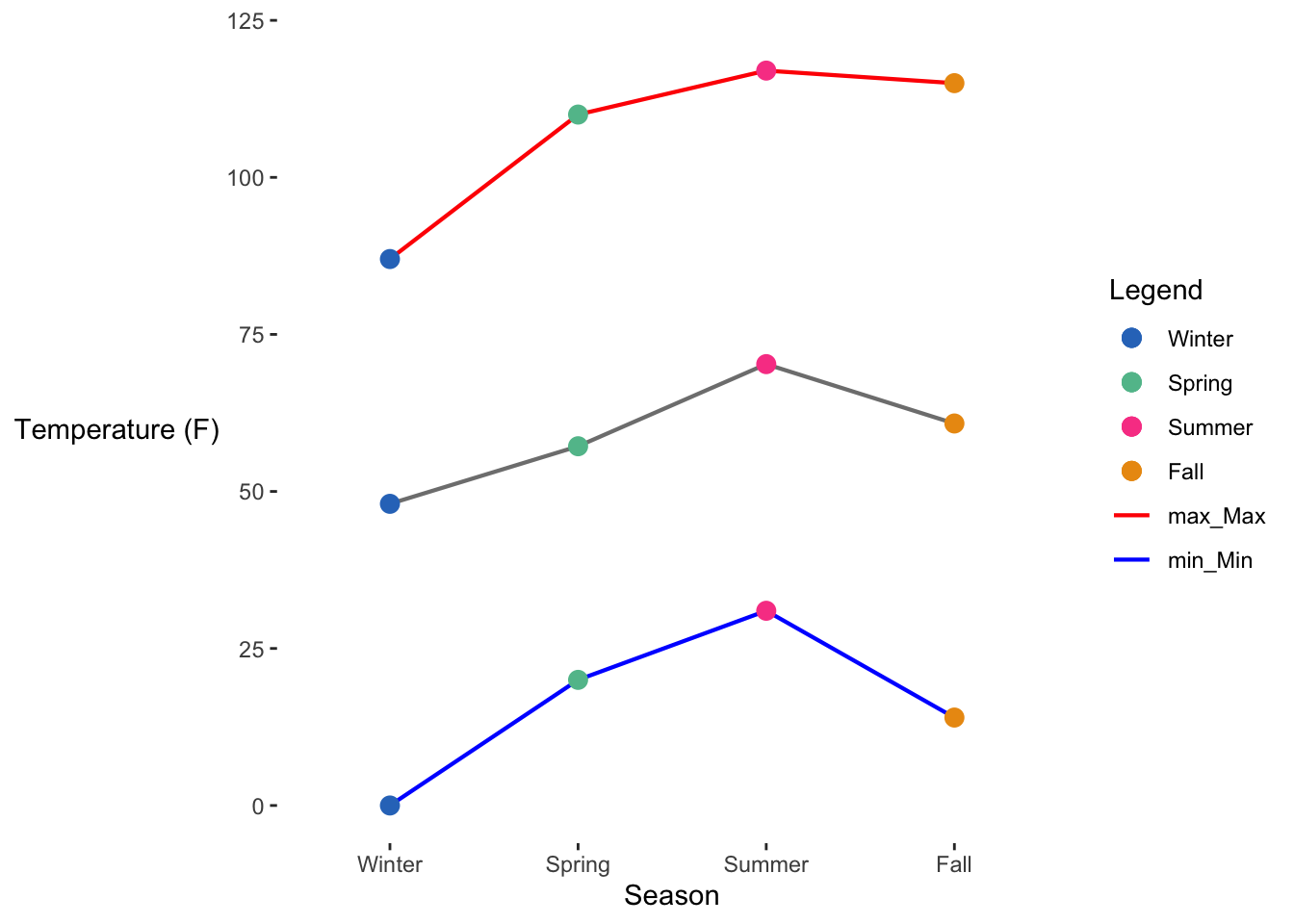
summary_table_seasonal %>%
  ggplot(aes(x = season)) +
  geom_line(aes(y = min_Min, col = "min_Min", group = 1), linewidth = .75) +
  geom_line(aes(y = mean_Mean, col = "mean_Mean", group = 1), linewidth = .75) +
  geom_line(aes(y = max_Max, col = "max_Max", group = 1), linewidth = .75) +
  geom_point(aes(y = min_Min, col = season, group = 1), size = 3) +
  geom_point(aes(y = mean_Mean, col = season, group = 1), size = 3) +
  geom_point(aes(y = max_Max, col = season, group = 1), size = 3) +
  scale_color_manual(values = plot_cols, name = "Legend") +
  geom_point(data = monthly_weather, aes(x = season, y = min, col = season), alpha = 0.1, position = position_jitter()) +
  geom_point(data = monthly_weather, aes(x = season, y = mean, col = season), alpha = 0.1, position = position_jitter()) +
  geom_point(data = monthly_weather, aes(x = season, y = max, col = season), alpha = 0.1, position = position_jitter()) +
  ylab("Temperature (F)")+ xlab("Year") +
   theme(panel.grid.major = element_blank(),
       panel.grid.minor = element_blank(),
       panel.background = element_blank(),
       axis.line = element_blank(),
       axis.title.y = element_text(angle = 0, vjust = .5))+ ylim(c(0, 120))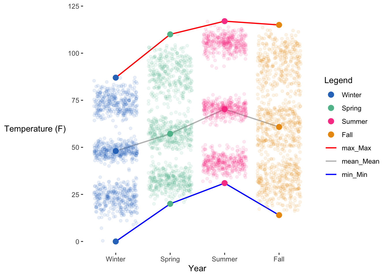
## chat help

facet_vars <- c("min", "mean", "max")

# Step 1: Pivot your summary table
vline_data <- summary_table_seasonal%>%
  group_by(season) %>%
  pivot_longer(cols = contains(c("min_Min", "mean_Mean", "max_Max")),
               names_to = "Statistic", values_to = "xintercept")
vline_data$Statistic = rep(facet_vars, times = 4)


monthly_weather %>%
  bind_cols(summary_table_seasonal[rep(1, nrow(monthly_weather)), ]) %>%
  select(-c(xmin, xmax)) %>%
  pivot_longer(cols = contains(c("min", "mean", "max")), names_to = "Statistic") %>%
  filter(Statistic %in% facet_vars) %>%
  select(year, month, date, season...7, Statistic, value) %>%
  rename(season=season...7) %>%
  ggplot(aes(x = value, fill = season)) +
  geom_histogram(bins = 30) +
  geom_vline(
    data = vline_data,
    aes(xintercept = xintercept, col = Statistic),
    linewidth = 1, linetype = "dashed"
  ) +
  facet_grid(Statistic~season, scales = "fixed") +
  theme_minimal() +
  scale_fill_manual(values = plot_cols) +
  scale_color_manual(values = plot_cols)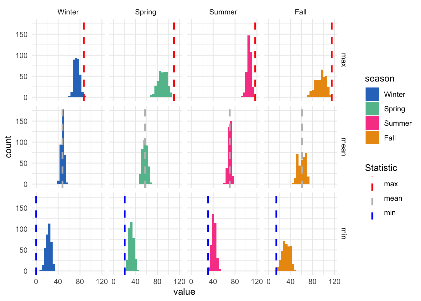
summary_table_seasonal %>%
 select(-c(max_Min, min_Max, min_Mean, max_Mean))%>%
gt() %>%
  tab_header(
    title = "All-time Summaries"
  ) %>%
  fmt_number(
    columns = where(is.numeric),
    decimals = 2
  )%>%
  cols_label(
    min_Min = "Min",
    mean_Min = "Mean",
    sd_Min = "SD",
    mean_Mean = "Mean",
    sd_Mean = "SD",
    max_Max = "Max",
    mean_Max = "Mean",
    sd_Max= "SD"
  ) %>%
  tab_spanner(
    label = "Monthly Minimums",
    columns = c(min_Min, mean_Min, sd_Min)
  ) %>%
  tab_spanner(
    label = "Monthly Means",
    columns = c(mean_Mean, sd_Mean)
  ) %>%
  tab_spanner(
    label = "Monthly Maximums",
    columns = c(mean_Max, sd_Max, max_Max)
)| All-time Summaries | ||||||||
|---|---|---|---|---|---|---|---|---|
| season |
Monthly Means
|
Monthly Maximums
|
Monthly Minimums
|
|||||
| Mean | SD | Mean | SD | Max | Min | Mean | SD | |
| Winter | 48.03 | 2.99 | 73.94 | 4.86 | 87.00 | 0.00 | 22.77 | 5.07 |
| Spring | 57.19 | 4.48 | 88.89 | 8.05 | 110.00 | 20.00 | 32.15 | 4.35 |
| Summer | 70.27 | 3.02 | 105.45 | 3.87 | 117.00 | 31.00 | 41.79 | 3.77 |
| Fall | 60.82 | 6.87 | 94.62 | 9.17 | 115.00 | 14.00 | 31.90 | 7.16 |
summary_table_yearly<- monthly_weather %>%
  group_by(year) %>%
   summarise(
    ## mean
    mean_Min = mean(min, na.rm = T),
    mean_Mean = mean(mean, na.rm = T),
    mean_Max = mean(max, na.rm = T),
    ## sd
    sd_Min= sd(min, na.rm = T),
    sd_Mean = sd(mean, na.rm = T),
    sd_Max = sd(max, na.rm = T),
    ## max
    max_Min = max(min, na.rm = T),
    max_Mean = max(mean, na.rm = T),
    max_Max = max(max, na.rm = T),
    ## min
    min_Min = min(min, na.rm = T),
    min_Mean = min(mean, na.rm = T),
    min_Max = min(max, na.rm = T),
  )%>%
  arrange(year)

plot_cols <- c(plot_cols, "min_Min" = "blue", "mean_Mean" = "grey", "max_Max" = "red")


agg_plot <- summary_table_yearly %>%
  filter(year >1909) %>%
  ggplot(aes(x = year)) +
  geom_line(aes(y = min_Min, col = "min_Min", group = 1), linewidth = .75) +
  geom_line(aes(y = mean_Mean, col = "Mean_mean", group = 1), linewidth = .75) +
  geom_line(aes(y = max_Max, col = "max_Max", group = 1), linewidth = .75) +
  geom_point(aes(y = min_Min, col = "min_Min", group = 1), size = 3) +
  geom_point(aes(y = mean_Mean, col = "Mean_mean", group = 1), size = 3) +
  geom_point(aes(y = max_Max, col = "max_Max", group = 1), size = 3) +
  scale_color_manual(values = plot_cols, name = "Legend") +
  ylab("Temperature (F)")+ xlab("Year") +
   theme(panel.grid.major = element_blank(),
       panel.grid.minor = element_blank(),
       panel.background = element_blank(),
       axis.line = element_blank(),
       axis.title.y = element_text(angle = 0, vjust = .5)) + ylim(c(0,120))

agg_plot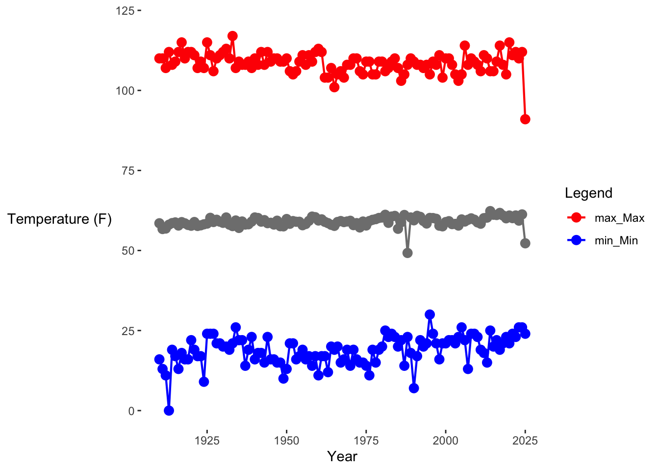
agg_plot +
  geom_point(data = monthly_weather, aes(x = year, y = min, col = "min"), alpha = 0.1, position = position_jitter()) +
  geom_point(data = monthly_weather, aes(x = year, y = mean, col = "mean"), alpha = 0.1, position = position_jitter()) +
  geom_point(data = monthly_weather, aes(x = year, y = max, col = "max"), alpha = 0.1, position = position_jitter()) +
  ylab("Temperature (F)")+ xlab("Year") +
   theme(panel.grid.major = element_blank(),
       panel.grid.minor = element_blank(),
       panel.background = element_blank(),
       axis.line = element_blank(),
       axis.title.y = element_text(angle = 0, vjust = .5))+ ylim(c(0, 120))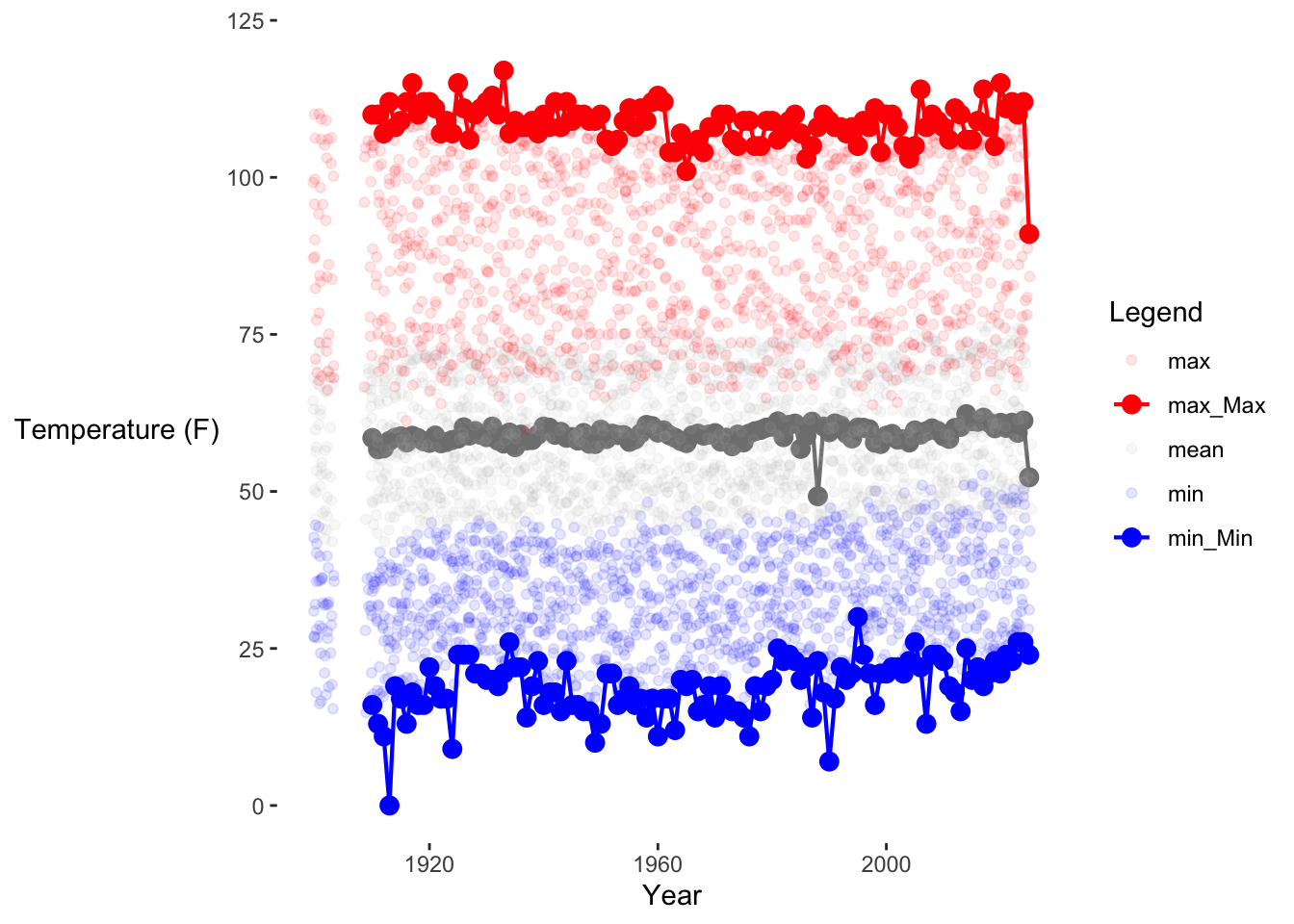
agg_plot +
  geom_point(data = monthly_weather, aes(x = year, y = min, col = season), alpha = 0.1, position = position_jitter()) +
  geom_point(data = monthly_weather, aes(x = year, y = mean, col =season), alpha = 0.1, position = position_jitter()) +
  geom_point(data = monthly_weather, aes(x = year, y = max, col = season), alpha = 0.1, position = position_jitter()) +
  ylab("Temperature (F)")+ xlab("Year") +
   theme(panel.grid.major = element_blank(),
       panel.grid.minor = element_blank(),
       panel.background = element_blank(),
       axis.line = element_blank(),
       axis.title.y = element_text(angle = 0, vjust = .5))+ ylim(c(0, 120))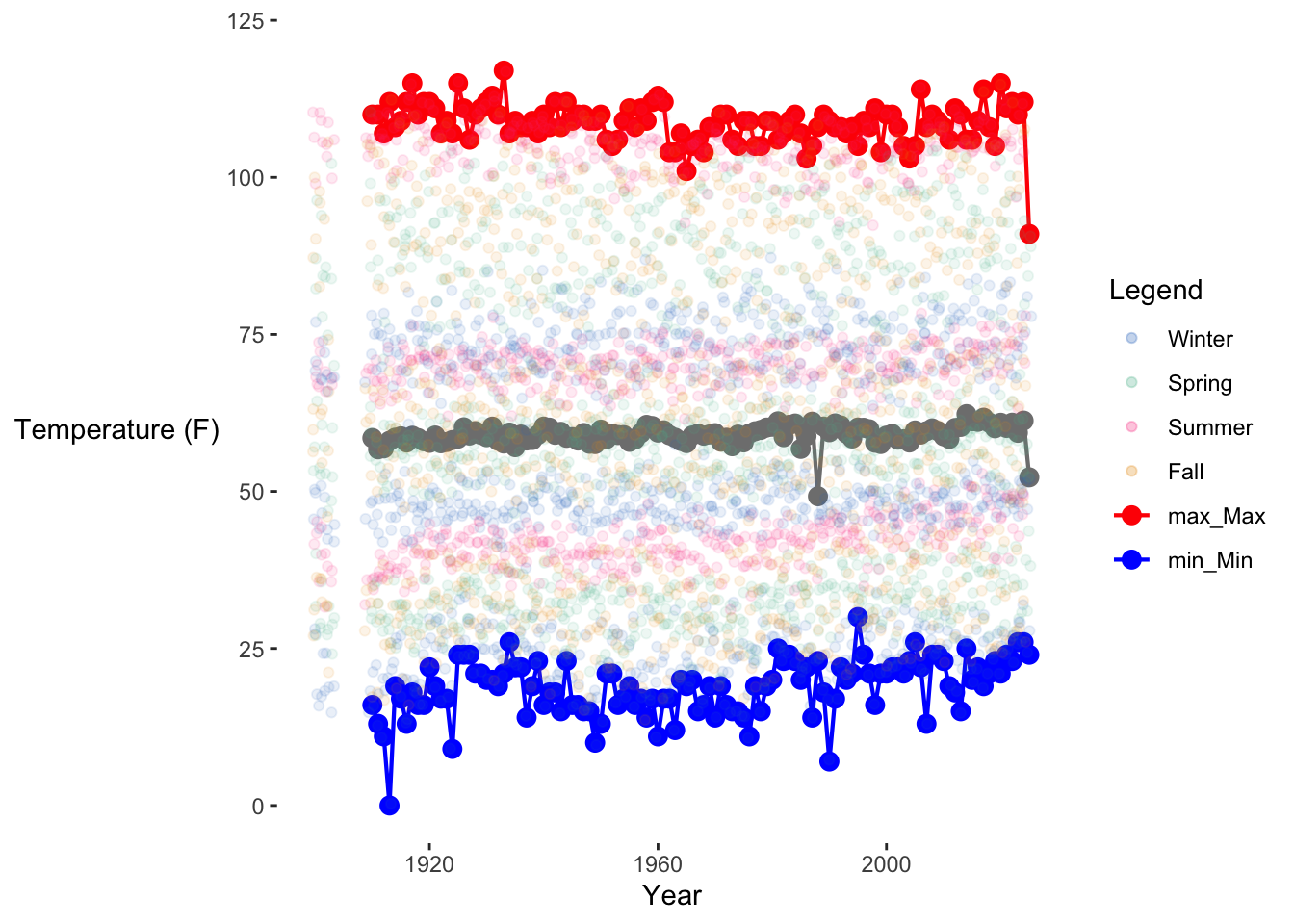
summary_table_yearly %>%
  mutate(year = ymd(paste0(year, "-01-01")))%>% select(-c(max_Min, min_Max, min_Mean, max_Mean))%>%
gt() %>%
  tab_header(
    title = "All-time Summaries"
  ) %>%
    fmt_number(
    columns = where(is.numeric),
    decimals = 2
  )%>%
  fmt_date(
    columns = year,
    date_style = "year"
  )%>%
  cols_label(
    min_Min = "Min",
    mean_Min = "Mean",
    sd_Min = "SD",
    mean_Mean = "Mean",
    sd_Mean = "SD",
    max_Max = "Max",
    mean_Max = "Mean",
    sd_Max= "SD"
  ) %>%
  tab_spanner(
    label = "Monthly Minimums",
    columns = c(min_Min, mean_Min, sd_Min)
  ) %>%
  tab_spanner(
    label = "Monthly Means",
    columns = c(mean_Mean, sd_Mean)
  ) %>%
  tab_spanner(
    label = "Monthly Maximums",
    columns = c(mean_Max, sd_Max, max_Max)
)| All-time Summaries | ||||||||
|---|---|---|---|---|---|---|---|---|
| year |
Monthly Means
|
Monthly Maximums
|
Monthly Minimums
|
|||||
| Mean | SD | Mean | SD | Max | Min | Mean | SD | |
| 1900 | 58.77 | 8.01 | 89.50 | 13.22 | 110.00 | 18.00 | 33.00 | 8.24 |
| 1901 | 58.44 | 9.56 | 89.00 | 15.30 | 110.00 | 16.00 | 31.17 | 8.71 |
| 1902 | 54.15 | 9.50 | 86.83 | 15.88 | 109.00 | 18.00 | 28.58 | 7.08 |
| 1903 | 54.67 | 10.53 | 85.43 | 17.12 | 106.00 | 15.00 | 27.14 | 8.28 |
| 1904 | NaN | NA | NaN | NA | −Inf | Inf | NaN | NA |
| 1905 | NaN | NA | NaN | NA | −Inf | Inf | NaN | NA |
| 1906 | NaN | NA | NaN | NA | −Inf | Inf | NaN | NA |
| 1907 | NaN | NA | NaN | NA | −Inf | Inf | NaN | NA |
| 1908 | NaN | NA | NaN | NA | −Inf | Inf | NaN | NA |
| 1909 | 62.28 | 9.91 | 95.40 | 16.35 | 106.00 | 15.00 | 29.00 | 8.37 |
| 1910 | 58.51 | 8.41 | 94.83 | 14.06 | 110.00 | 16.00 | 28.42 | 7.99 |
| 1911 | 56.71 | 8.74 | 90.83 | 13.49 | 110.00 | 13.00 | 28.58 | 8.77 |
| 1912 | 56.86 | 8.61 | 88.67 | 14.58 | 107.00 | 11.00 | 27.33 | 9.18 |
| 1913 | 58.06 | 9.85 | 93.08 | 14.08 | 112.00 | 0.00 | 27.17 | 10.62 |
| 1914 | 58.56 | 7.45 | 91.50 | 13.61 | 108.00 | 19.00 | 30.33 | 6.58 |
| 1915 | 58.77 | 8.86 | 91.58 | 14.76 | 109.00 | 17.00 | 29.92 | 8.07 |
| 1916 | 57.80 | 10.24 | 90.25 | 15.69 | 112.00 | 13.00 | 27.50 | 9.29 |
| 1917 | 58.87 | 11.25 | 94.00 | 15.83 | 115.00 | 18.00 | 28.58 | 8.13 |
| 1918 | 58.49 | 10.57 | 92.50 | 12.08 | 110.00 | 16.00 | 30.25 | 9.51 |
| 1919 | 57.98 | 9.92 | 90.33 | 15.26 | 112.00 | 16.00 | 29.42 | 8.13 |
| 1920 | 57.73 | 9.14 | 88.67 | 15.80 | 112.00 | 22.00 | 33.75 | 7.03 |
| 1921 | 58.90 | 9.06 | 91.75 | 12.64 | 111.00 | 19.00 | 32.58 | 7.76 |
| 1922 | 57.67 | 10.96 | 86.58 | 16.36 | 107.00 | 17.00 | 30.83 | 7.69 |
| 1923 | 57.87 | 9.34 | 90.25 | 14.04 | 109.00 | 17.00 | 32.50 | 8.47 |
| 1924 | 58.18 | 8.74 | 90.08 | 13.61 | 107.00 | 9.00 | 31.00 | 9.50 |
| 1925 | 58.41 | 8.00 | 90.83 | 14.17 | 115.00 | 24.00 | 33.00 | 6.58 |
| 1926 | 60.21 | 9.04 | 91.83 | 12.90 | 111.00 | 24.00 | 35.08 | 5.55 |
| 1927 | 58.90 | 8.68 | 89.67 | 13.83 | 106.00 | 24.00 | 33.75 | 6.08 |
| 1928 | 59.61 | 8.99 | 91.83 | 15.09 | 110.00 | 21.00 | 33.50 | 7.54 |
| 1929 | 59.01 | 10.11 | 91.83 | 15.07 | 111.00 | 21.00 | 32.25 | 8.01 |
| 1930 | 58.64 | 8.75 | 90.50 | 12.82 | 112.00 | 20.00 | 33.42 | 7.04 |
| 1931 | 60.32 | 10.43 | 92.50 | 14.62 | 113.00 | 20.00 | 34.58 | 7.51 |
| 1932 | 58.08 | 10.51 | 91.00 | 15.50 | 110.00 | 19.00 | 32.58 | 7.50 |
| 1933 | 57.62 | 10.34 | 91.42 | 17.55 | 117.00 | 21.00 | 31.25 | 7.84 |
| 1934 | 59.38 | 8.46 | 91.25 | 13.88 | 107.00 | 26.00 | 33.67 | 4.72 |
| 1935 | 57.05 | 10.23 | 88.92 | 13.81 | 109.00 | 22.00 | 31.33 | 7.64 |
| 1936 | 59.06 | 10.14 | 89.75 | 15.60 | 108.00 | 22.00 | 33.17 | 7.07 |
| 1937 | 58.11 | 11.21 | 88.67 | 16.07 | 108.00 | 14.00 | 32.50 | 8.82 |
| 1938 | 58.19 | 9.33 | 88.50 | 14.57 | 109.00 | 19.00 | 32.67 | 8.80 |
| 1939 | 59.02 | 9.81 | 90.75 | 14.08 | 107.00 | 23.00 | 31.50 | 6.60 |
| 1940 | 60.33 | 7.93 | 91.83 | 14.10 | 110.00 | 16.00 | 31.67 | 9.31 |
| 1941 | 60.15 | 7.14 | 89.08 | 12.69 | 108.00 | 18.00 | 32.17 | 7.93 |
| 1942 | 59.01 | 10.14 | 91.58 | 14.54 | 112.00 | 18.00 | 30.83 | 9.07 |
| 1943 | 59.49 | 7.81 | 92.33 | 11.97 | 108.00 | 15.00 | 31.25 | 8.02 |
| 1944 | 58.53 | 8.65 | 90.67 | 14.39 | 112.00 | 23.00 | 30.75 | 6.65 |
| 1945 | 58.66 | 9.54 | 91.67 | 14.36 | 109.00 | 16.00 | 29.33 | 8.26 |
| 1946 | 58.10 | 10.10 | 89.92 | 13.83 | 110.00 | 16.00 | 29.25 | 9.36 |
| 1947 | 59.31 | 10.12 | 93.67 | 13.58 | 110.00 | 15.00 | 29.75 | 9.24 |
| 1948 | 57.59 | 9.64 | 90.42 | 13.67 | 109.00 | 15.00 | 27.67 | 10.33 |
| 1949 | 57.54 | 10.69 | 89.50 | 15.71 | 109.00 | 10.00 | 29.25 | 10.22 |
| 1950 | 59.83 | 8.01 | 92.92 | 13.89 | 110.00 | 13.00 | 30.75 | 8.79 |
| 1951 | 58.34 | 9.29 | 90.67 | 14.69 | 106.00 | 21.00 | 30.42 | 8.07 |
| 1952 | 59.19 | 9.89 | 91.17 | 12.68 | 105.00 | 21.00 | 31.92 | 7.04 |
| 1953 | 58.98 | 8.78 | 91.50 | 10.47 | 106.00 | 16.00 | 29.67 | 9.27 |
| 1954 | 58.98 | 9.01 | 91.42 | 13.45 | 109.00 | 17.00 | 29.33 | 8.35 |
| 1955 | 57.89 | 9.51 | 90.17 | 13.32 | 111.00 | 19.00 | 29.42 | 7.14 |
| 1956 | 58.28 | 9.22 | 89.58 | 12.86 | 108.00 | 16.00 | 30.42 | 8.69 |
| 1957 | 59.27 | 9.89 | 89.67 | 14.94 | 111.00 | 17.00 | 32.00 | 10.54 |
| 1958 | 60.59 | 9.40 | 90.67 | 13.74 | 109.00 | 14.00 | 32.42 | 10.63 |
| 1959 | 60.41 | 9.41 | 92.58 | 11.97 | 112.00 | 17.00 | 30.58 | 9.08 |
| 1960 | 59.37 | 9.75 | 91.08 | 14.61 | 113.00 | 11.00 | 31.17 | 9.29 |
| 1961 | 59.73 | 10.54 | 91.08 | 14.44 | 112.00 | 17.00 | 30.00 | 9.53 |
| 1962 | 58.95 | 8.86 | 90.50 | 10.38 | 104.00 | 17.00 | 30.67 | 9.38 |
| 1963 | 58.55 | 9.30 | 88.25 | 11.99 | 104.00 | 12.00 | 31.50 | 9.45 |
| 1964 | 58.03 | 9.63 | 90.50 | 12.63 | 107.00 | 20.00 | 29.67 | 8.77 |
| 1965 | 57.69 | 9.08 | 88.42 | 9.97 | 101.00 | 19.00 | 30.67 | 7.49 |
| 1966 | 58.91 | 9.52 | 91.00 | 13.45 | 105.00 | 20.00 | 29.67 | 7.33 |
| 1967 | 59.20 | 10.94 | 88.67 | 14.37 | 106.00 | 15.00 | 32.50 | 10.02 |
| 1968 | 58.88 | 9.08 | 90.17 | 11.75 | 104.00 | 16.00 | 29.75 | 8.14 |
| 1969 | 59.07 | 9.66 | 89.50 | 13.55 | 108.00 | 19.00 | 32.58 | 8.44 |
| 1970 | 59.28 | 8.86 | 91.58 | 14.50 | 108.00 | 14.00 | 30.25 | 8.28 |
| 1971 | 57.92 | 10.25 | 90.58 | 13.43 | 110.00 | 19.00 | 28.17 | 8.90 |
| 1972 | 58.56 | 9.71 | 89.92 | 13.33 | 110.00 | 16.00 | 30.00 | 8.55 |
| 1973 | 57.20 | 9.13 | 88.33 | 15.29 | 106.00 | 15.00 | 29.55 | 7.06 |
| 1974 | 59.05 | 9.67 | 89.92 | 13.62 | 105.00 | 15.00 | 31.50 | 8.96 |
| 1975 | 57.81 | 9.24 | 90.50 | 12.00 | 109.00 | 14.00 | 28.83 | 10.25 |
| 1976 | 59.21 | 9.47 | 94.08 | 12.00 | 109.00 | 11.00 | 29.50 | 10.66 |
| 1977 | 59.58 | 9.23 | 91.08 | 11.83 | 105.00 | 19.00 | 30.25 | 8.16 |
| 1978 | 59.79 | 9.68 | 90.00 | 13.90 | 105.00 | 15.00 | 32.58 | 7.55 |
| 1979 | 60.17 | 10.13 | 89.50 | 15.01 | 109.00 | 19.00 | 31.33 | 9.24 |
| 1980 | 60.30 | 8.05 | 93.25 | 12.61 | 109.00 | 20.00 | 31.83 | 7.49 |
| 1981 | 61.16 | 8.77 | 90.42 | 12.16 | 106.00 | 25.00 | 34.17 | 6.99 |
| 1982 | 58.64 | 9.48 | 87.67 | 14.25 | 107.00 | 23.00 | 32.92 | 6.50 |
| 1983 | 60.61 | 8.95 | 88.25 | 14.55 | 109.00 | 24.00 | 36.17 | 7.49 |
| 1984 | 60.81 | 10.51 | 91.33 | 14.08 | 110.00 | 23.00 | 32.33 | 6.65 |
| 1985 | 56.78 | 9.66 | 90.75 | 12.84 | 107.00 | 20.00 | 31.42 | 8.58 |
| 1986 | 58.83 | 9.25 | 90.67 | 10.05 | 103.00 | 22.00 | 32.75 | 6.89 |
| 1987 | 61.10 | 7.77 | 89.92 | 14.61 | 105.00 | 14.00 | 31.75 | 10.96 |
| 1988 | 49.23 | 5.70 | 91.83 | 11.88 | 108.00 | 23.00 | 32.67 | 7.94 |
| 1989 | 60.33 | 9.45 | 92.00 | 11.62 | 110.00 | 18.00 | 32.50 | 9.43 |
| 1990 | 59.42 | 11.32 | 93.58 | 12.35 | 109.00 | 7.00 | 31.50 | 12.67 |
| 1991 | 60.83 | 8.79 | 90.92 | 13.06 | 108.00 | 17.00 | 32.58 | 9.90 |
| 1992 | 60.51 | 9.95 | 88.50 | 12.69 | 108.00 | 22.00 | 36.58 | 8.99 |
| 1993 | 59.22 | 8.77 | 89.83 | 13.08 | 107.00 | 20.00 | 33.58 | 8.38 |
| 1994 | 58.43 | 9.93 | 89.42 | 12.09 | 108.00 | 21.00 | 33.42 | 8.87 |
| 1995 | 60.17 | 7.98 | 88.50 | 12.31 | 105.00 | 30.00 | 35.67 | 5.55 |
| 1996 | 60.13 | 8.56 | 92.00 | 13.81 | 109.00 | 24.00 | 33.42 | 6.72 |
| 1997 | 59.90 | 9.01 | 89.42 | 12.71 | 108.00 | 21.00 | 34.42 | 8.30 |
| 1998 | 57.75 | 9.82 | 86.17 | 14.97 | 111.00 | 16.00 | 35.67 | 9.39 |
| 1999 | 57.55 | 8.89 | 88.67 | 12.12 | 104.00 | 21.00 | 33.42 | 8.34 |
| 2000 | 58.88 | 9.14 | 89.33 | 15.06 | 110.00 | 21.00 | 34.67 | 8.72 |
| 2001 | 59.16 | 10.25 | 90.83 | 14.35 | 110.00 | 22.00 | 35.08 | 8.75 |
| 2002 | 58.24 | 9.71 | 91.00 | 14.59 | 108.00 | 22.00 | 33.67 | 8.24 |
| 2003 | 58.31 | 9.60 | 87.09 | 13.90 | 105.00 | 21.00 | 33.55 | 8.77 |
| 2004 | 57.79 | 9.23 | 87.36 | 13.89 | 103.00 | 23.00 | 33.73 | 8.30 |
| 2005 | 59.71 | 9.11 | 87.58 | 12.40 | 105.00 | 26.00 | 35.92 | 6.75 |
| 2006 | 59.05 | 11.02 | 90.08 | 13.71 | 114.00 | 22.00 | 35.25 | 9.67 |
| 2007 | 59.59 | 10.53 | 93.83 | 11.87 | 108.00 | 13.00 | 33.58 | 10.59 |
| 2008 | 60.04 | 10.55 | 93.58 | 14.09 | 110.00 | 24.00 | 35.67 | 8.96 |
| 2009 | 59.62 | 10.31 | 93.17 | 13.54 | 109.00 | 24.00 | 34.00 | 8.16 |
| 2010 | 58.78 | 8.47 | 91.08 | 14.12 | 108.00 | 23.00 | 34.42 | 6.95 |
| 2011 | 58.37 | 9.75 | 89.17 | 12.30 | 106.00 | 19.00 | 34.00 | 8.55 |
| 2012 | 60.10 | 10.00 | 94.17 | 13.47 | 111.00 | 18.00 | 33.75 | 9.55 |
| 2013 | 60.27 | 10.66 | 92.83 | 12.91 | 110.00 | 15.00 | 34.08 | 9.95 |
| 2014 | 62.31 | 8.45 | 94.08 | 11.86 | 106.00 | 25.00 | 36.83 | 8.96 |
| 2015 | 61.17 | 10.09 | 93.08 | 11.85 | 106.00 | 20.00 | 36.08 | 10.85 |
| 2016 | 61.08 | 8.97 | 91.58 | 13.82 | 109.00 | 22.00 | 35.33 | 8.13 |
| 2017 | 61.74 | 10.35 | 93.50 | 14.60 | 114.00 | 19.00 | 36.08 | 9.89 |
| 2018 | 60.93 | 9.45 | 91.75 | 12.14 | 108.00 | 21.00 | 34.92 | 9.93 |
| 2019 | 60.06 | 9.85 | 88.83 | 13.82 | 105.00 | 23.00 | 33.17 | 7.90 |
| 2020 | 60.92 | 10.43 | 94.83 | 14.96 | 115.00 | 21.00 | 35.08 | 9.87 |
| 2021 | 60.11 | 9.71 | 93.75 | 11.79 | 111.00 | 24.00 | 34.50 | 8.87 |
| 2022 | 60.94 | 11.28 | 93.00 | 14.74 | 112.00 | 23.00 | 36.00 | 9.90 |
| 2023 | 59.33 | 9.74 | 88.75 | 14.57 | 110.00 | 26.00 | 35.58 | 8.38 |
| 2024 | 61.27 | 10.46 | 91.58 | 15.05 | 112.00 | 26.00 | 36.83 | 9.25 |
| 2025 | 52.25 | 4.21 | 84.60 | 5.41 | 91.00 | 24.00 | 33.00 | 8.00 |
When the seasonal max or min reaches a new high or low, indicate this with a true/false.
out <- monthly_weather %>%
group_by(season) %>%
arrange(date) %>%
mutate(
start_flag = year > 1977,
cummax = cummax_ignore_na(max, start_flag),
cummin = cummin_ignore_na(min, start_flag),
new_max = cummax == max,
new_min = cummin == min
) %>%
ungroup()

monthly_weather$new_max <- out$new_max
monthly_weather$new_min <- out$new_min
We can either set this to start from the beginning of the series, or start the “tracker” at a certain specific time. Since we will have three parts to our music and we want the exceedances to be part 3, we will start the tracker in 1977 (see Sonifcation Design page for reasoning behind choice of 1977).
out_all <- monthly_weather %>%
arrange(date) %>%
mutate(
start_flag = year > 1899,
cummax = cummax_ignore_na(max, start_flag),
cummin = cummin_ignore_na(min, start_flag),
new_max = cummax == max,
new_min = cummin == min
) %>%
ungroup()

monthly_weather$new_max_all_time <- out_all$new_max
monthly_weather$new_min_all_time <- out_all$new_min

monthly_weather %>%
ggplot(aes(x = date)) +
  geom_line(aes(y = min, color = "min")) +
  geom_point(aes(y = min, color = "min"), alpha = 0.1) +
  geom_line(aes(y = max, color = "max")) +
  geom_point(aes(y = max, color = "max"), alpha = 0.1) +
  geom_point(data = filter(monthly_weather, new_max_all_time),
             aes(x = date, y = max, color = "max"), size = 6, shape = 17) +
  geom_point(data = filter(monthly_weather, new_min_all_time),
             aes(x = date, y = min, color = "min"), size = 6, shape = 15) +
  scale_color_manual(values = plot_cols, name = "Exceedance\nType") +
  scale_x_date(labels = monthly_weather$season_year[monthly_weather$season == "Winter" & monthly_weather$season_year %%5 ==0],
               breaks = monthly_weather$xmin[monthly_weather$season == "Winter"& monthly_weather$season_year %%5 ==0]) +
  theme(axis.text.x = element_text(angle = 25))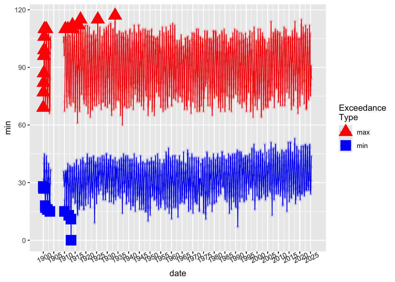
out <- monthly_weather %>%
arrange(date) %>%
mutate(
start_flag = year > 1977,
cummax = cummax_ignore_na(max, start_flag),
cummin = cummin_ignore_na(min, start_flag),
new_max = cummax == max,
new_min = cummin == min
) %>%
ungroup()

monthly_weather$new_max <- out$new_max
monthly_weather$new_min <- out$new_min

monthly_weather %>%
ggplot(aes(x = date)) +
  geom_line(aes(y = min, color = "min")) +
  geom_point(aes(y = min, color = "min"), alpha = 0.1) +
  geom_line(aes(y = max, color = "max")) +
  geom_point(aes(y = max, color = "max"), alpha = 0.1) +
  geom_point(data = filter(monthly_weather, new_max),
             aes(x = date, y = max, color = "max"), size = 6, shape = 17) +
  geom_point(data = filter(monthly_weather, new_min),
             aes(x = date, y = min, color = "min"), size = 6, shape = 15) +
  scale_color_manual(values = plot_cols, name = "Exceedance\nType") +
  scale_x_date(labels = monthly_weather$season_year[monthly_weather$season == "Winter" & monthly_weather$season_year %%5 ==0],
               breaks = monthly_weather$xmin[monthly_weather$season == "Winter"& monthly_weather$season_year %%5 ==0]) +
  theme(axis.text.x = element_text(angle = 25))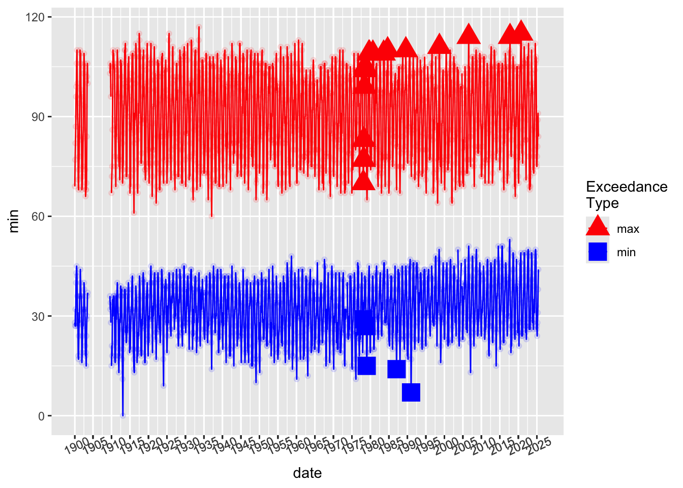
Most of the all time highs occur in summer, and most all-time lows occur in winter. This is unsurprising, and basically a consequence of the statistics we are looking at and the properties of the maximum and the minimum.
Since our goal is to summarize data for sonification, we want to make sure the information does not get frontloaded all at the beginning. So, looking at seasonal exceedances gives us more chances to hear extremes.
Note that the unusually high fall temperatures are both for all time and if we start the “new extreme” timer in 1977.
out_all <- monthly_weather %>%
group_by(season)%>%
arrange(date) %>%
mutate(
start_flag = year > 1899,
cummax = cummax_ignore_na(max, start_flag),
cummin = cummin_ignore_na(min, start_flag),
new_max = cummax == max,
new_min = cummin == min
) %>%
ungroup()

monthly_weather$new_max_all_time <- out_all$new_max
monthly_weather$new_min_all_time <- out_all$new_min

monthly_weather %>%
ggplot(aes(x = date)) +
  geom_line(aes(y = min, color = "min")) +
  geom_point(aes(y = min, color = "min"), alpha = 0.1) +
  geom_line(aes(y = max, color = "max")) +
  geom_point(aes(y = max, color = "max"), alpha = 0.1) +
  geom_point(data = filter(monthly_weather, new_max_all_time),
             aes(x = date, y = max, color = season), size = 6, shape = 17) +
  geom_point(data = filter(monthly_weather, new_min_all_time),
             aes(x = date, y = min, color = season), size = 6, shape = 15) +
  scale_color_manual(values = plot_cols, name = "Exceedance\nType") +
  scale_x_date(labels = monthly_weather$season_year[monthly_weather$season == "Winter" & monthly_weather$season_year %%5 ==0],
               breaks = monthly_weather$xmin[monthly_weather$season == "Winter"& monthly_weather$season_year %%5 ==0]) +
  theme(axis.text.x = element_text(angle = 25))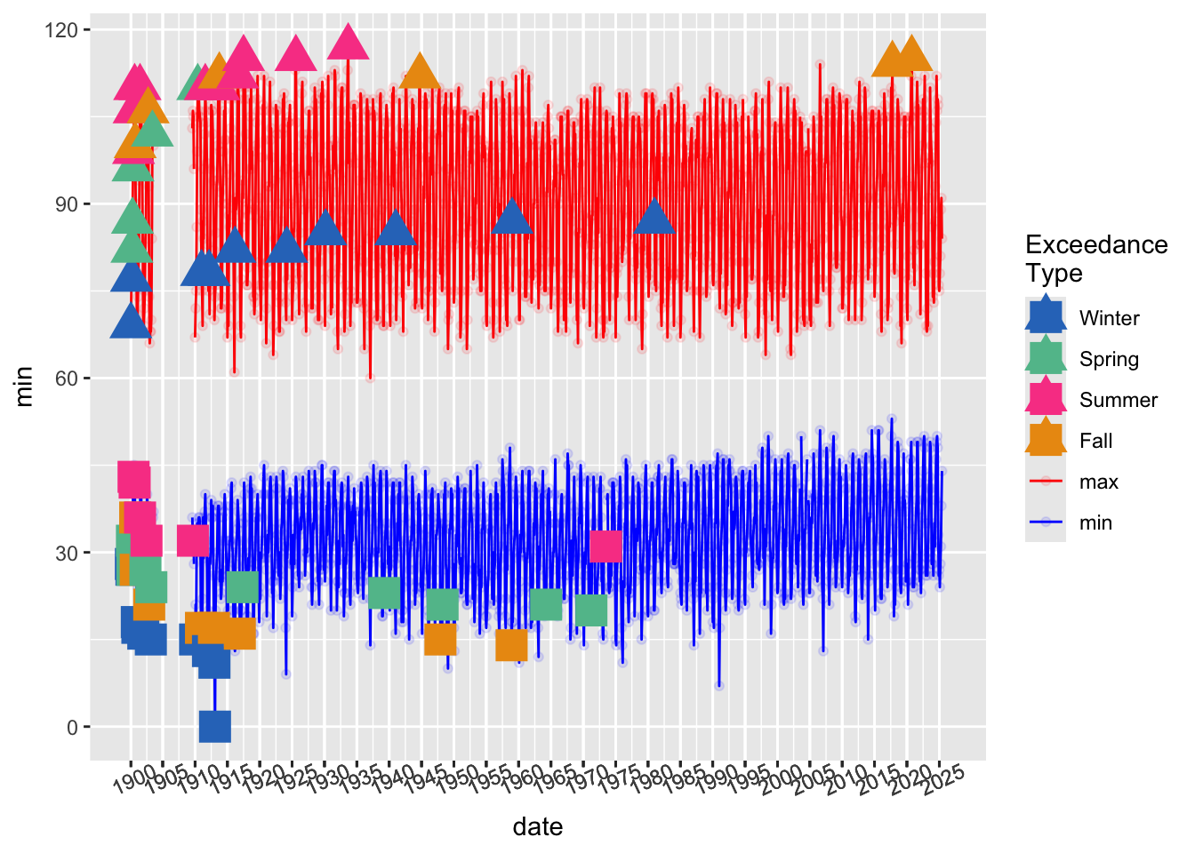
out <- monthly_weather %>%
group_by(season)%>%
arrange(date) %>%
mutate(
start_flag = year > 1977,
cummax = cummax_ignore_na(max, start_flag),
cummin = cummin_ignore_na(min, start_flag),
new_max = cummax == max,
new_min = cummin == min
) %>%
ungroup()

monthly_weather$new_max <- out$new_max
monthly_weather$new_min <- out$new_min

monthly_weather %>%
ggplot(aes(x = date)) +
  geom_line(aes(y = min, color = "min")) +
  geom_point(aes(y = min, color = "min"), alpha = 0.1) +
  geom_line(aes(y = max, color = "max")) +
  geom_point(aes(y = max, color = "max"), alpha = 0.1) +
  geom_point(data = filter(monthly_weather, new_max),
             aes(x = date, y = max, color = season), size = 6, shape = 17) +
  geom_point(data = filter(monthly_weather, new_min),
             aes(x = date, y = min, color = season), size = 6, shape = 15) +
  scale_color_manual(values = plot_cols, name = "Exceedance\nType") +
  scale_x_date(labels = monthly_weather$season_year[monthly_weather$season == "Winter" & monthly_weather$season_year %%5 ==0],
               breaks = monthly_weather$xmin[monthly_weather$season == "Winter"& monthly_weather$season_year %%5 ==0]) +
  theme(axis.text.x = element_text(angle = 25))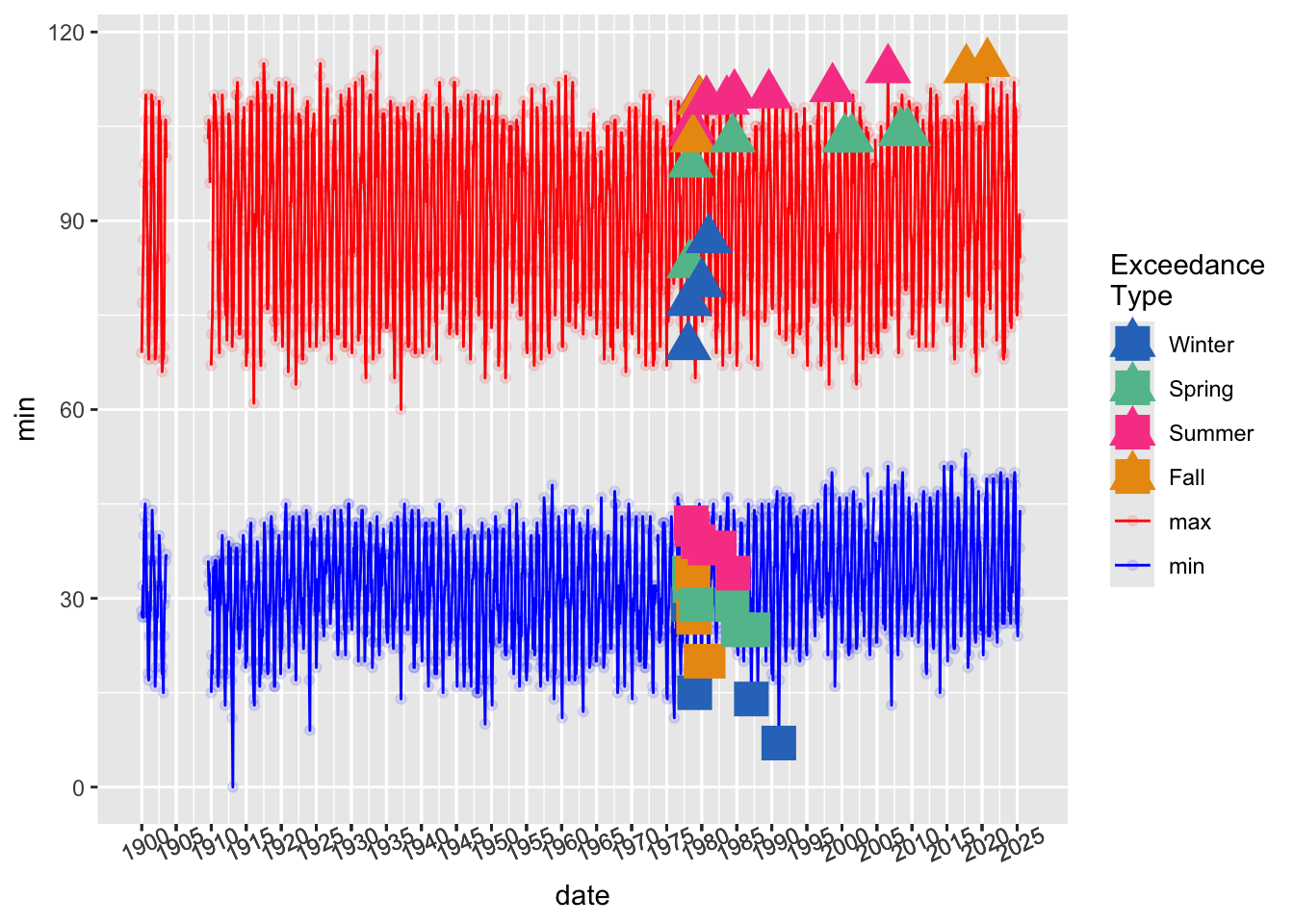
As you will hear (and see) in the animation, there are occasionally missing data points, resulting in silence!
## code inspired by https://r-graph-gallery.com/79-levelplot-with-ggplot2.html
x <- monthly_weather$date
y <- c("min", "avg", "max")
data <- expand.grid(X=x, Y=y)
data$Z <- c(ifelse(is.na(monthly_weather$min),"missing", "observed"),
            ifelse(is.na(monthly_weather$mean),"missing", "observed"),
            ifelse(is.na(monthly_weather$max),"missing", "observed"))
n_year <- nrow(monthly_weather)/12

x_breaks <- seq(from = ymd(monthly_weather$date[1]),
                to = ymd(monthly_weather$date[1392]),
                length.out = floor(n_year/10))
x_labs <- year(x_breaks)

change_date_part_1 <- ymd("1910-01-01")
change_date_part_2 <- monthly_weather[which.max(monthly_weather$max),"date"] %>% pull()
change_date_part_3 <- ymd("1977-01-01")

data %>% tibble() %>%
mutate(X = as.Date(X, "%Y-%m-%d"))%>%
  ggplot(aes(x= X, y=factor(Y), fill = Z)) +
  geom_tile(height = 0.5) +
  scale_x_date(breaks = x_breaks, labels = x_labs) +
  scale_fill_manual(name = "",
    values = c("missing" = "black", "observed" = "grey90")
  ) + ylab("Summary \nStatistic") + xlab("Year (one line per month)") +
 theme(panel.grid.major = element_blank(),
       panel.grid.minor = element_blank(),
       panel.background = element_blank(),
       axis.line = element_blank(),
       axis.title.y = element_text(angle = 0, vjust = .5))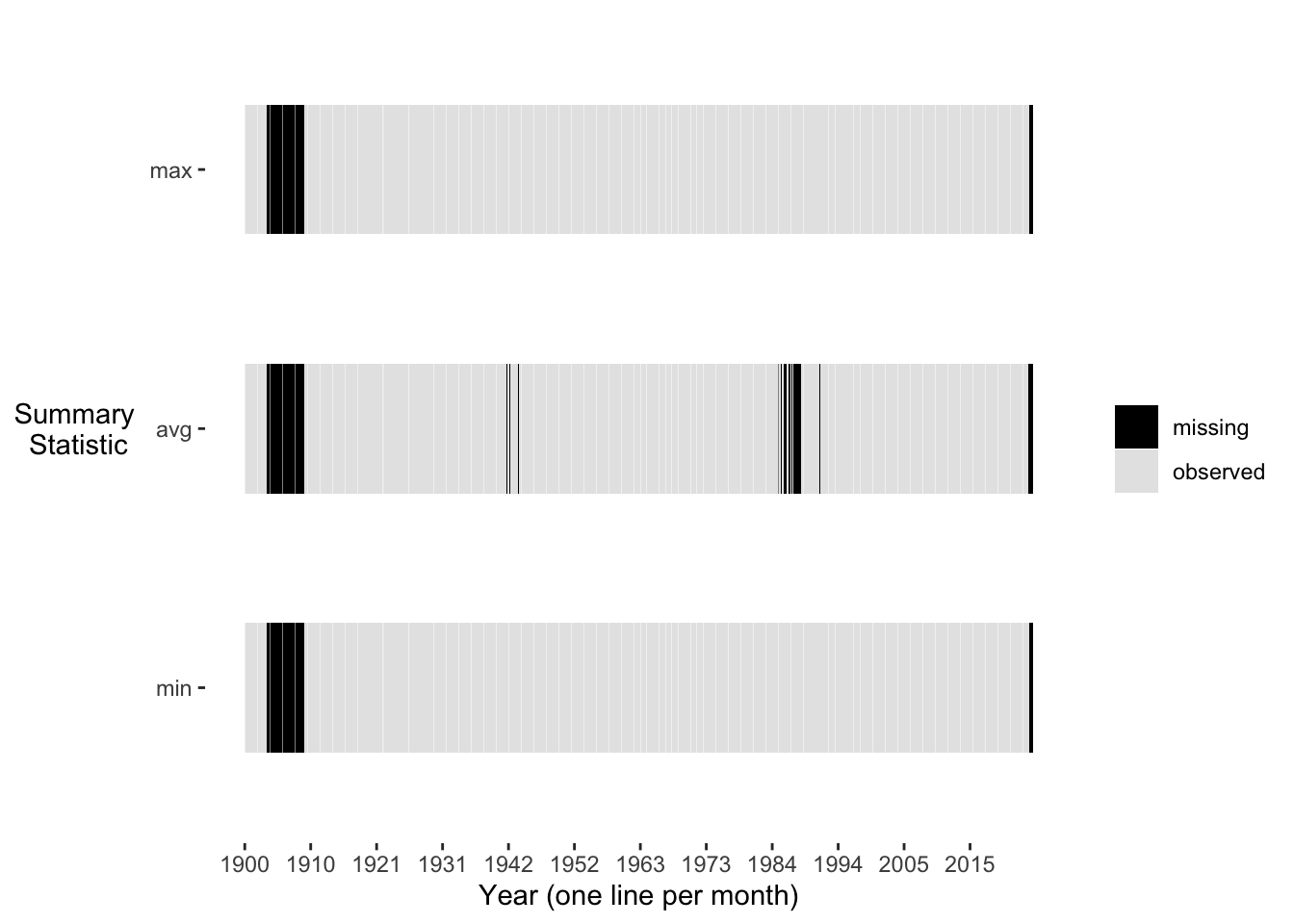
Since we are looking at monthly level data, presumably, each data point represents the summary (average, max, min) of 28, 29, 30, or 31 data points. However, there are exceptions
May 2025 values of all 3 summary statistics only include at most 9 points, since the data set was sourced May 9, 2025
the NOWData tool only reports the monthly values, and does not indicate whether any of the daily (or lower level data that the daily values may be aggregated from) values were missing.
While busy, this is a visualization of the entire data set we will be working with for our sonification.
The full monthly history of the series is too much for one plot– this is why we want to animate and/or sonify it– to add a time dimension to our perceptualization and allowing us to “zoom in” as we did on the beginning of the series above.
ggplot(monthly_weather, aes(x = date)) +
  geom_line(aes(y = min, color = "min")) +
  geom_point(aes(y = min, color = season)) +
  geom_line(aes(y = max, color = "max")) +
  geom_point(aes(y = max, color = season)) +
  geom_line(aes(y = mean, color = "mean")) +
  geom_point(aes(y = mean, color = season)) +
  geom_point(data = filter(monthly_weather, new_max),
             aes(x = date, y = max, color = season), size = 6, shape = 17) +
  geom_point(data = filter(monthly_weather, new_min),
             aes(x = date, y = min, color = season), size = 6, shape = 15) +
  scale_color_manual(values = plot_cols) +
  scale_x_date(labels = monthly_weather$season_year[monthly_weather$season == "Winter" & monthly_weather$season_year %%5 ==0],
               breaks = monthly_weather$xmin[monthly_weather$season == "Winter"& monthly_weather$season_year %%5 ==0]) +
  theme(axis.text.x = element_text(angle = 25))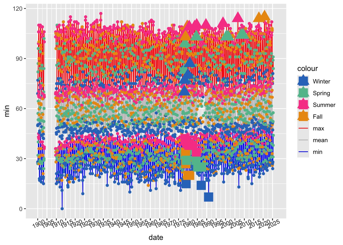
This file is read in at the top of the sonification design details.
save(monthly_weather, file = "data/monthly_weather")
save(plot_cols, file = "data/plot_cols")