ww <- read.csv(#your code here)

ww$dates <- as.Date(# your code here)

#install.packages("tidyverse")
library(tidyverse)
ww_WWTP <- ww %>% dplyr::filter(#your code here)Stat 416 Assignment 1 Due Monday, September 30 at 11:59:59PM
A paper I worked on as a research scientist considered the time series of the concentration (measured as \(\log_{10}\) copies per Liter) of the SARS-CoV-2 virus from 5 different locations in the City of Houston, visualized in parts (c)-(g) of the figure below.
The goal of this study was to see whether the information gleaned from sampling the lift stations, which represent smaller populations, was different than the information gleaned from sampling only the larger wastewater treatment plant. In other words, one research question was to determine whether the WWTP (dark blue) time series has different dynamics (behavior) than those that represent the lift stations.
The methods in this paper are touched on in chapter 8 of our textbook. For this assignment, we will use the wastewater data as an example and practice our plotting and time series data science skills.
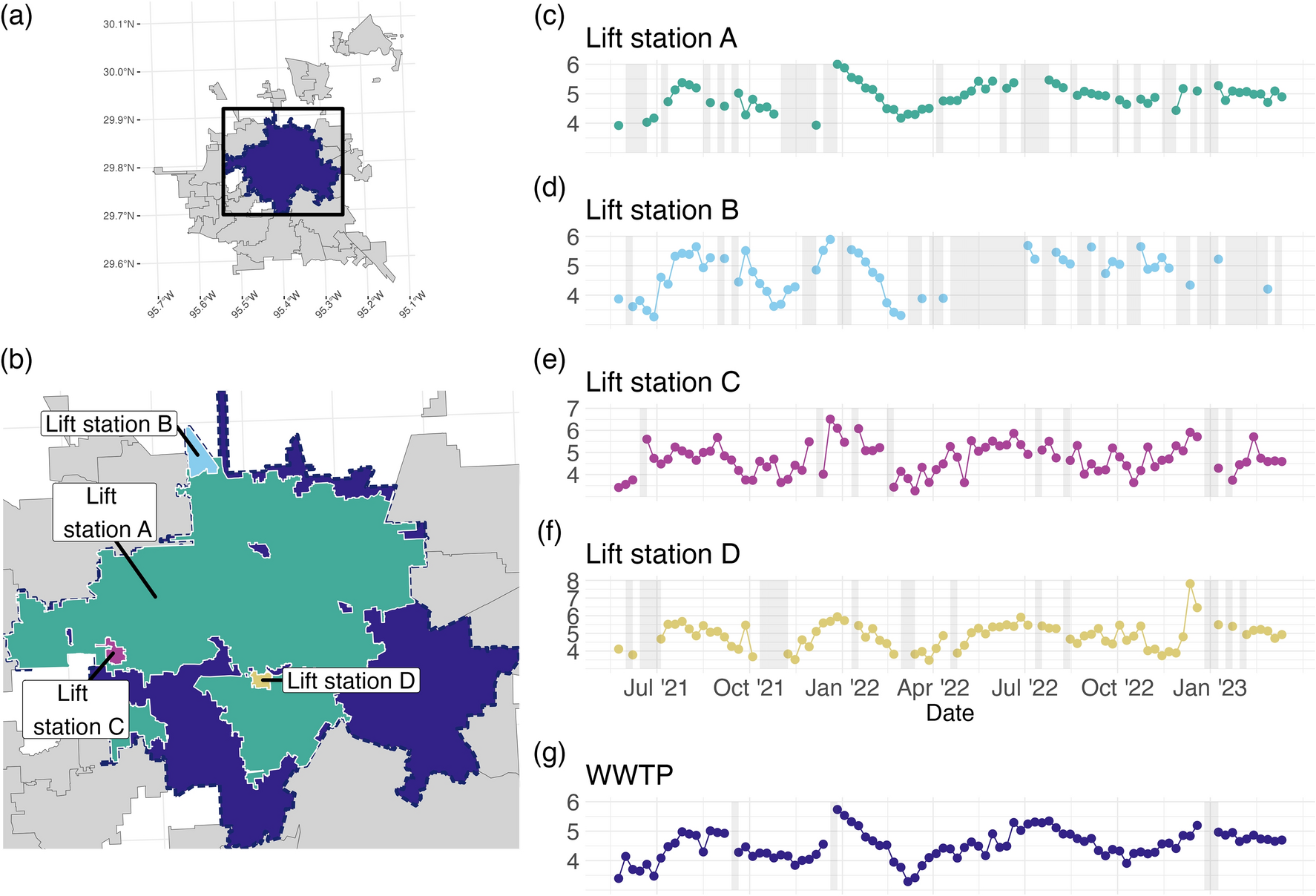
Which of the time series has the most missing data? Which appears to have the most variability? Does the overall behavior of the series seem to be similar?
Load the (synthetic) wastewater data from https://raw.githubusercontent.com/hou-wastewater-epi-org/online_trend_estimation/refs/heads/main/Data/synthetic_ww_time_series.csv using the
read.csvfunctionInspect the data. Verify that each of the series from the map above are included in the .csv (hint: what are the unique values of the
namefield?)Convert the date field to a Date format using the function as.Date.
Install and load the
tidyversepackage.We will work with just the WWTP series for now. Use
dplyr::filterto extract the values for just the WWTP series.What is the time interval between the observations? How do you know?
Use the
tsplotfunction from theastsapackage to plot theWWTPseries.Make sure to use the
datesfield for the x-axis and specify good axis and plot labels using thexlab/ylab, andmainarguments. (see the documentation?tsplotfor more)Apply a moving average filter with 3 time points using the stats::filter function and save the result in a vector called
ww_ma_3. You can choose the order of the moving average. (Similar to the final part of problem 1.1, see here in Lecture Notes).ww_ma_3 <- stats::filter(#your code here)Plot the moving average you computed on top of the tsplot in a different color using the lines function (see linked Problem 1.1 above). In the call to the lines function, also use
type = landlwd = 2.tsplot(# your code here) lines(# your code here)Apply the moving average filter again, but this time use 5 time points, call it
ww_ma_5. Plot just theWWTPseries data and theww_ma_5you just computed, and use a different color for this MA process than you used in question 10.Inspect the plot you generated in questions 10 and 11. Which MA process looks “smoother”?
Describe the different way that the missing data in the WWTP series impacts the moving average estimates for the case of 3 time points vs. 5 time points.